Accessibility and HTML
The primary role of the browser in web accessibility is to connect HTML to the accessibility layer of the operating system. To achieve that, browser makers follow the Accessibility API Mapping standards so that their browsers correctly interpret our markup, and we follow web standards so that our markup is correctly interpreted by browsers.
This means that when we write well-structured HTML, without altering the default behaviors, it is innately accessible. It’s that easy—job done. You can go home now.
Well-structured HTML is the secret weapon of web accessibility. With a solid HTML foundation, a site becomes instantly more accessible to a much wider audience.
The Importance of Structure
HTML is simple and easy to read because its basic job is to provide structure to a web page’s content. It’s mostly just content surrounded with element tags. Many of us don’t bother thinking or learning about HTML elements in depth, as they just seem so straightforward. But there’s a lot of accessibility goodness to master in the default behavior of HTML elements, and this makes them worth taking the time to understand.
View the bare HTML structure of any web page by removing its CSS styles. You can do this using any modern web browser:
- Firefox: Go to View > Page Styles > No Style.
- Safari: Enable Developer Tools in Preferences > Advanced > Checkbox for “Show Develop menu in menu bar”. Then from the Develop menu, select Disable Styles.
- Internet Explorer: Go to Command Bar > Page > Style > No Style.
- Opera and Chrome (also works for Firefox and Safari): Download Chris Pederick’s Web Developer extension (https://a4e.link/05/01/). Then from the Web Developer extension, go to CSS > Disable CSS.
Unstyled HTML looks slightly different in each browser because it uses the browser’s default styles. These default styles vary depending on the combination of the browser and the operating system. When we write CSS, we override the browser’s default styles with our own.
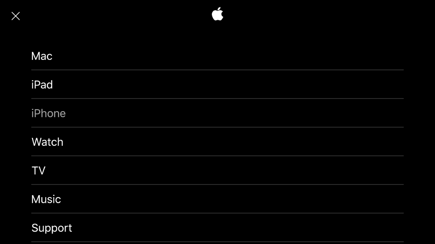
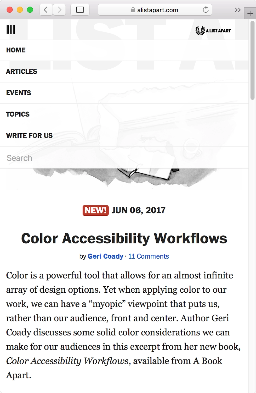
A unstyled view of an HTML document approximates the way it would be read by a screen reader—from top to bottom. If the most important information on a page is at the bottom, most visitors will skim and skip and scroll to get to the good stuff. But screen readers can’t skim for patterns and context, so it’s crucial that the content is in an order that make sense to the screen reader, with the most important information appearing first (Fig 5.1).
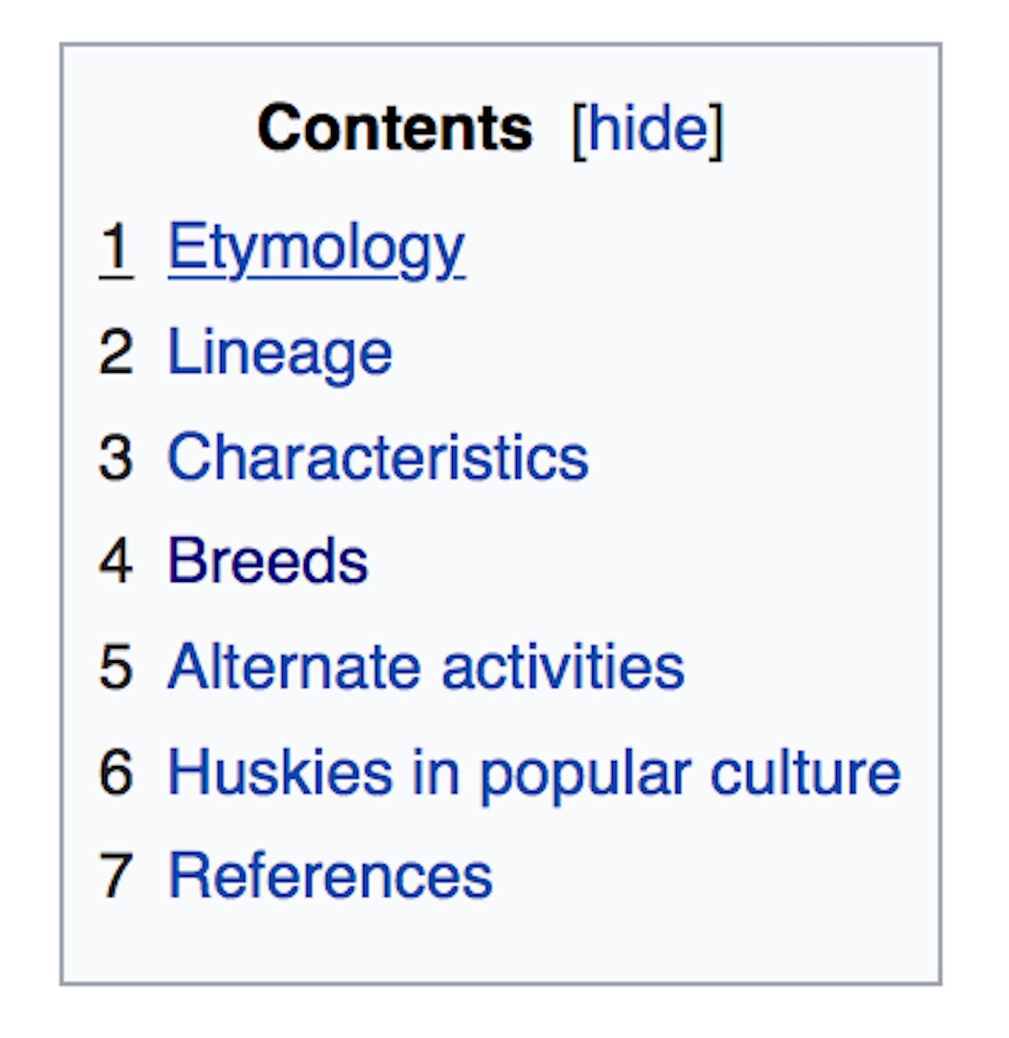
Books usually have tables of contents to give the book structure and show the reader what’s to come. In the same way, screen readers benefit from headings and other structural HTML elements that create a content outline for a web page (Fig 5.2).
An accessible content structure also gives search engines something to grab onto, making content easier for people to find.
Findability
Search engines rely on crawlers that index websites for content, then use algorithms to determine the relevance of that content to search keywords. Good accessibility increases findability because it benefits search engine optimization. Search engine crawlers behave much like screen readers: they can’t easily or intelligently understand images, audio, or video, so they benefit from text alternatives and well-written content.
If you look at Google’s design and content guidelines, they’re exactly the same as the suggestions you’d find in accessibility guidelines (https://a4e.link/05/02/):
“Create a useful, information-rich site, and write pages that clearly and accurately describe your content.”
“Think about the words users would type to find your pages, and make sure that your site actually includes those words within it.”
“Design your site to have a clear conceptual page hierarchy.”
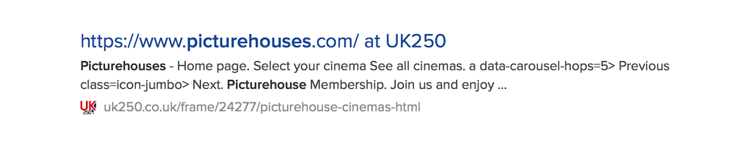
A clear site structure and hierarchy allows search engines to better understand what the most valuable content is on your site, and what would make up a valuable preview in search results. If you look at some typical Google (Fig 5.3) and DuckDuckGo (Fig 5.4) search results, you can see how each search engine uses the page title element for the main title of the result. They then use the first h1 and h2 elements to give you a rough idea of the content on that page.
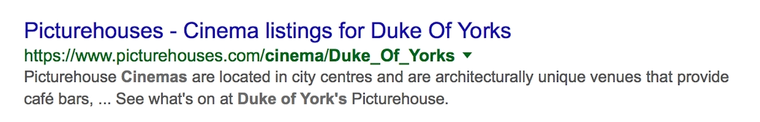
<title> for the result heading, then <meta description> and the page’s first <h1> as the result description.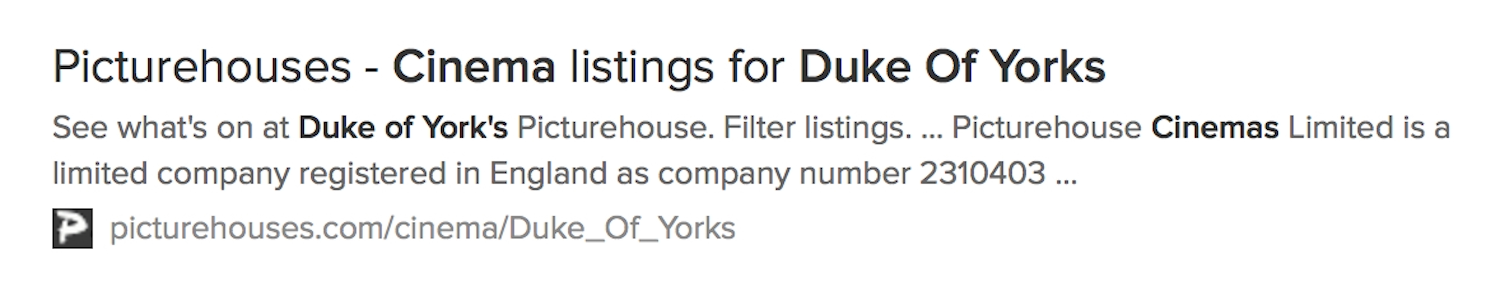
<title> for the result heading, then the first <h1> and a <p> from near the end of the page as the result description.When a page’s HTML isn’t structured clearly, it can have a negative effect on the search results preview (Fig 5.5). It’s much harder to identify the type of content you’d find on that page, so it’s less likely to come up in relevant search engine results.
Headings
In order to create a meaningful content outline, we need to use headings to create a structure (Fig 5.6). There is an argument that in HTML5 we can use more than one h1 element on a page, but browsers have better support when we use a singular h1 to title or describe the main function of a page.
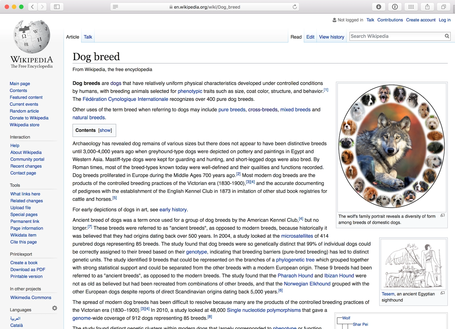
h2 elements describe second-level headings. There is often more than one h2 element on a page. h3, h4, h5, and h6 headings can be used to break content down even further. These elements tend to be seen less often, but the content outline for a highly-structured page (like a typical Wikipedia entry) reveals multiple heading levels in use.
If the text lacked hierarchy, it would take a lot longer for readers to skim, to understand what the page was about, or to locate a particular piece of information.
Lists
Lists are another way of breaking up body text into a meaningful structure. Lists break up text into bite-sized chunks, and it’s easy for screen readers and keyboard shortcuts to skip from one list item to the next just by reading the first few words.
The ul element is used for unordered lists, where the order of the list items isn’t really important. By default, browsers show ul list items with bullet points. The ol element is used for ordered lists, where a strict order is integral to the list—by default, browsers will number ol list items. Screen readers will usually read the numbers or say “bullet” at the beginning of each list item, even if the numbers or bullet points have been removed or hidden by the CSS styles.
Forms
Sometimes developers add JavaScript to a span or div element to make it interactive, and to mimic the behavior of a true interactive element like a button or an input. They do this to give themselves more control over the default appearance and behavior of an element. But this is a misuse of spans and divs. Not only will you lose the default accessibility benefits you’d get from the interactive elements, you can also waste a lot of time trying to recreate similar behavior and styles.
Incredibly rich interaction can be created through buttons and inputs, no JavaScript needed. Let’s take a look at some of the most important form elements and the default interactive behavior the browser provides for each.
Inputs
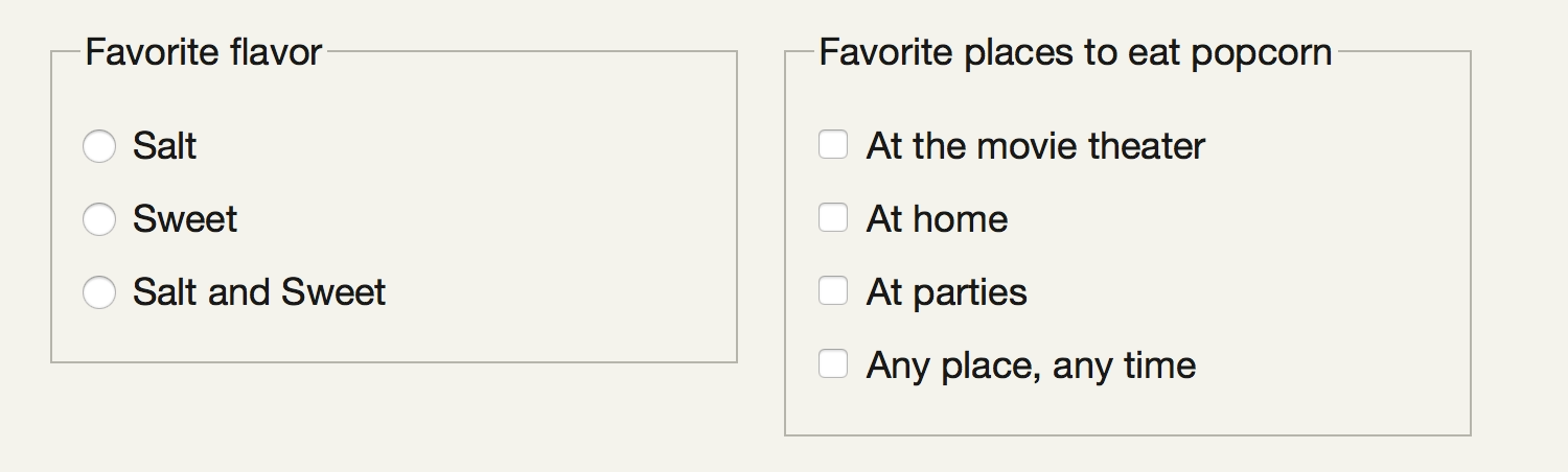
Different input elements—like text fields, dropdown selectors, radio buttons, and checkboxes—help people enter information into forms in different ways .
All of these input types come with default accessibility features that allow a screen reader to read the state of the input. For example, when someone selects a radio button that has already been selected, the screen reader reads “selected, radio button”. If the radio button is unselected, the screen reader just says “radio button”.
Labels
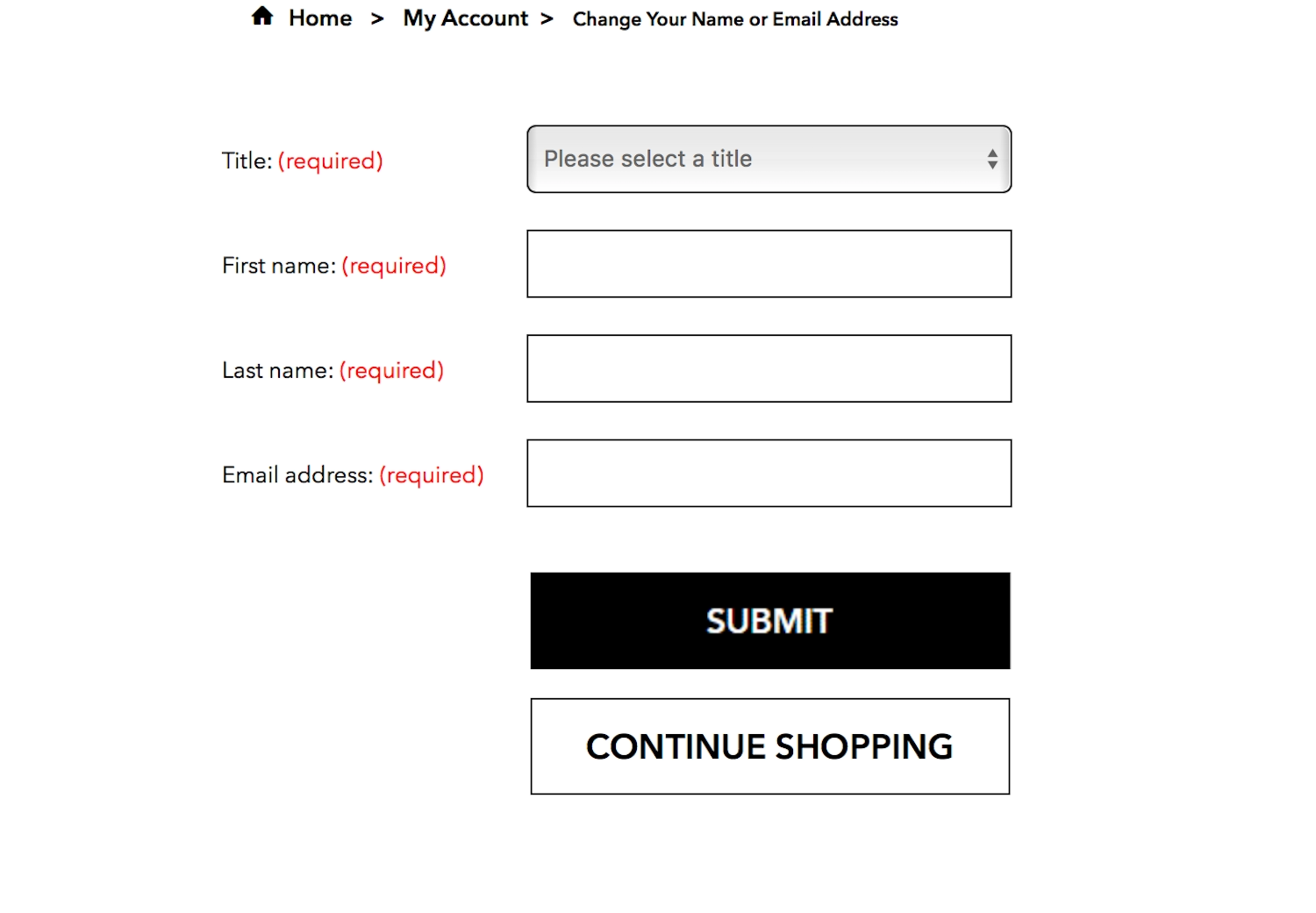
Without labels, input fields are useless. Labels describe the expected input. Similar to navigation labels, input labels should be clear and concise, explaining to the user exactly what’s expected. They should come before the input field in the HTML, so it’s clear which label is associated with which form field. Labels for radio buttons and checkboxes are also accessible when they come after the input in the HTML. The visual placement of the labels is also important for the user to understand the expected input (Fig 5.8).
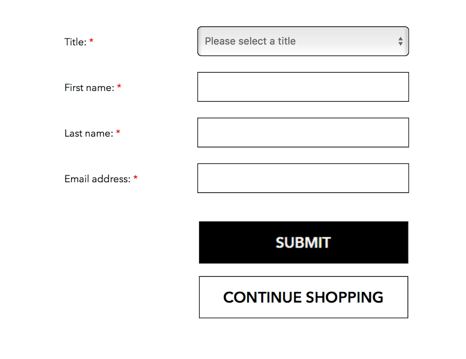
If the input field is required before a form can be submitted, the label should tell the user that. Often an asterisk is used to suggest a required field in a form, but this is a visual cue that only makes sense to users who have interacted with similar forms in the past (Fig 5.8).
The clearest way to show that a form field needs to be filled in is to clearly show the word “required” inside the label, alongside the name of the form field (Fig 5.9). This ensures there’s no confusion for sighted or screen reader users, for people who are seasoned fillers of forms, or for first-time web users.
Label and input pairs
Pairing labels and input fields makes a form accessible to screen readers. A screen reader will read a label and explain the nature of the corresponding form input: “Your name, text field.” Thus, when creating label and input pairs, it’s important to connect the two structurally, not just visually. Each form input should have a unique id, and its label should use the id of the input in its for= attribute. This literally tells the browser which input field the label is for.
Pairing has other usability benefits, too. Most browsers will give focus to, or select, a form input when the user interacts with the label for that field (Fig 5.10). This is very useful when form inputs such as radio buttons have a small interactive area—it reduces the likelihood of the user selecting the wrong input. Increasing the interactive area aids people who have motor difficulties or are using a touchscreen, where using a cursor accurately can be challenging.
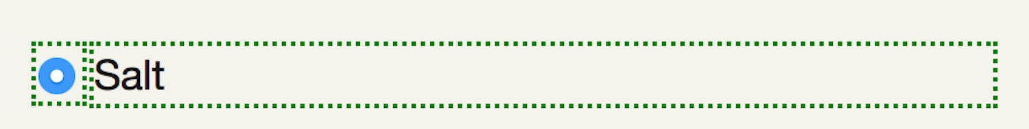
label is paired with the radio button, and its style is set to inline-block, clicking or tapping anywhere in the dotted area will select the corresponding radio button.Buttons
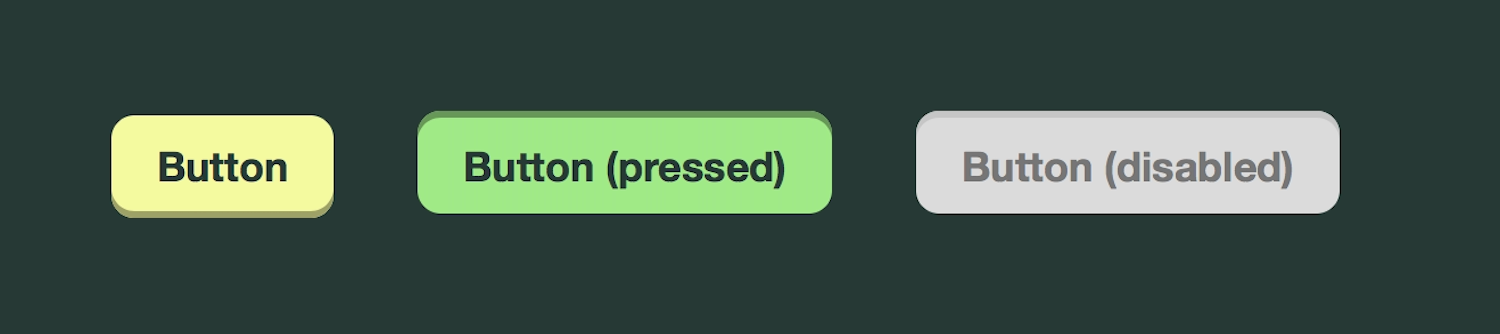
Like links, buttons can have different states: inactive, active, hover, focus, and disabled (Fig 5.11). They can also have default types of interaction: a submit button tells the browser to submit the contents of a form, while a reset button tells the browser to clear the contents of a form.
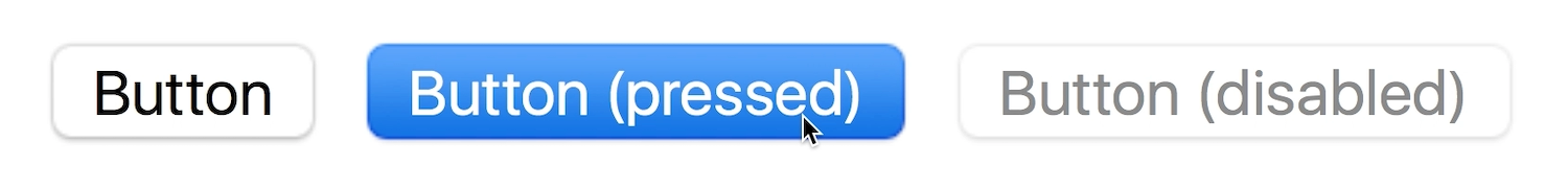
disabled attribute makes a button appear visually disabled in a grayed-out style (right), as well as letting assistive technology know it is functionally disabled.When we’re overriding these default styles with our own styles, we need to make sure we don’t lose the interactive styles that visually describe the button states (Fig 5.12). Disabled buttons are generally not recommended as they rely on the user’s understanding of the “disabled” visual style. Find out more about the usability issues with disabled buttons in the Resources section.
Keyboard Navigation
Keyboard navigation can be tricky if a site’s developers have built features without keyboard access. Writing well-structured HTML with meaningful elements is the best possible foundation. Forms, dropdown menus, navigation, video, and audio are particularly hard for people relying on a keyboard to access—for instance, dropdown menus and navigation can be very fiddly if you need to use a mouse to hover a menu open and move to select the desired item at the same time.
Keyboard shortcuts
Although keyboard shortcuts can be useful for people relying on keyboard navigation, they have pitfalls. To return to Sam’s experience, his cerebral palsy has made him “left-sided,” meaning that he performs almost all his actions with his left hand, and switching contexts between a mouse and a keyboard is difficult. Sam mostly uses one finger to type, which makes his typing staccato, and makes reaching for shortcut key combinations (or even switching between uppercase and lowercase characters) difficult.
With rich applications becoming more popular, some web apps are using text shortcuts to mimic the experience of a native app. For example, you can find a list of text shortcuts on Twitter by selecting Shift-? on twitter.com (Fig 5.13).
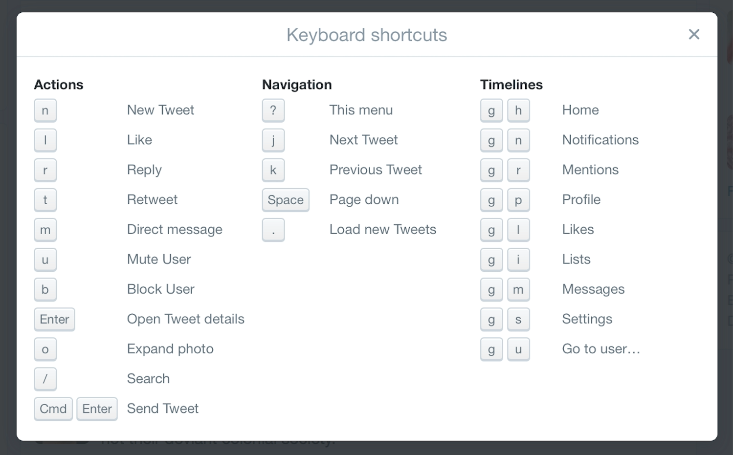
Twitter shortcuts are of great value to some people using screen readers. When new tweets are available in the timeline, focus moves to a notification that informs the user: “New tweets available. Press Period to review them.” The user doesn’t have to navigate to the tweets area, but can instead just use the Period key.
As useful as these shortcuts are, keyboard shortcuts provided by JavaScript don’t currently work with Windows screen readers. However, there is a hack to get around the problem, and support could be improved in the future. Read Léonie Watson’s post “Time to revisit accesskey?” for a more in-depth explanation (https://a4e.link/05/03/).
Access keys
Access keys went through a popular phase in the late 90s and early 00s, when developers created their own keyboard shortcuts for links on their sites using the accesskey HTML attribute. Often the navigation would show an underlined letter in the link text to inform the user of the access key shortcut, in a similar way to old Windows menus (Fig 5.14).

However, the modifier key for shortcuts varied across operating systems, and the access key modifiers (the key you hold down at the same time as the shortcut key) varied from browser to browser. As a result, access keys were confusing to document and use—in other words, not very accessible. We should bear this in mind if we create text shortcuts for our own sites, and not repeat the same mistakes we made in the past.
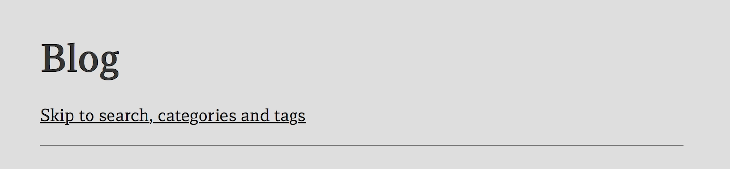
Skip links
Many sites use skip links to assist people using keyboard navigation. Skip links are a common accessibility feature allowing people to skip past lengthy navigation and go straight to the page content (Fig 5.15). They’ve also become a common form of navigation used on one-page sites that have a lot of content to scroll through.
Some sites choose to make skip links invisible unless you’re using a screen reader, but screen reader users rarely use skip links because screen readers have more sophisticated navigation to skip to content. Hiding skip links from everyone except screen reader users excludes the people who may benefit the most from skip links—sighted people using keyboard navigation. The best possible option is to make the skip links visible to all users so that all users benefit.
Keyboard focus and visual focus
Keyboard focus is the location on the page where the keyboard’s actions are interpreted by the browser. If the keyboard focus is the same as the visual focus (what you can see in the viewport), you’ll be able to see what you type on the screen. If the keyboard focus is on a form field further down the page, but the visual focus is still stuck at the top of the page, you won’t be able to see what you’re typing on the screen.
Keyboard focus is particularly important to people who rely on the keyboard to navigate the web, since some browsers don’t support skip links in HTML. At the time of writing, Safari and Chrome don’t change the keyboard focus to the visual focus area when someone follows a skip link. This means you might be looking at the section you skipped to, but the keyboard focus is still on the navigation at the top of the page. If you tab to the next item, your visual focus will scroll right back to the top of the page.
The disjunction between visual and keyboard focus makes skip links utterly useless for keyboard navigation users as they’re not actually skipping at all.
Focus and hover styles
Links, buttons, and inputs are given default interaction events and tabindex by the browser, and all are highlighted with focus styles by default. (We’ll return to tabindex shortly.) When we move through these elements using keyboard navigation, the focus styles allow us to see where we are, and tell assistive technologies what to expect.
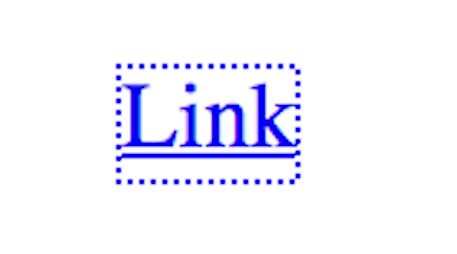
For people using keyboard navigation, focus styles (frequently displayed by browsers as a combination of dotted borders and blue glows) are indispensable. You might recognize these styles if you’ve removed them in the past when they didn’t fit in with your site’s aesthetic (Fig 5.16). (Don’t worry, I won’t tell anyone. Just go put them back now.)
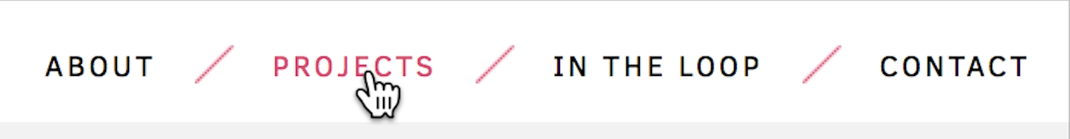
Like focus styles, hover styles give us visual feedback as we navigate a page. Hover styles are most frequently used to show that we can interact with an element. Think about how links and buttons often change to a different color when we hover over them (Fig 5.17).
Because hover styles are most commonly used on interactive elements, they shouldn’t be used on non-interactive elements. But at the same time, when designing hover styles, don’t rely on them for showing interaction. Not only are hover styles invisible to people with visual impairments, but they’re also hidden from most touchscreen users—touchscreen devices rarely support the hover action (Fig 5.18).
If you make spans, divs, and other usually non-interactive elements into interactive elements, you create confusion for those using screen readers and keyboard navigation, which rely on the accessible cues provided by the default HTML. Keyboard navigation demands special consideration in rich applications, because events can change regularly on a page, causing confusion and disorientation if focus isn’t managed correctly.
tabindex
HTML4 introduced the tabindex attribute, which describes the order of elements when navigated by keyboard (often done by pressing the Tab key). The standard tabindex is the order in which elements appear in the source code. If you want to make some elements appear in a different order to keyboard and screen reader users, you would use the tabindex attribute on the elements in question:
<ol>
<li><a href="/" tabindex="1">Home</a></li>
<li><a href="about.html" tabindex="3">About</a></li>
<li><a href="contact.html" tabindex="2">Contact</a></li>
</ol>
But you shouldn’t do this! If you did this, the tab order would be “Home, Contact, About.” It would really confuse sighted people using keyboard navigation.
If a keyboard navigation user uses the Tab key to navigate, the tabindex order is honored, but if they use their cursor keys to navigate, the tabindex order is ignored. Because of these inconsistencies, altering the tab index is generally not advisable.
tabindex="0" and tabindex="-1" have distinct functions. tabindex="0" tells the keyboard navigation to recognize an element in the standard tab order. This can be used to make a non-interactive element, such as a p or a div, into an element that can be reached with keyboard tabbing. But as I’ve just described with focus styles, turning non-interactive elements into interactive elements can flummox people using screen readers and keyboard navigation.
tabindex="-1" removes an element from the tab index. That way no one can tab to it but the element can still receive focus from a link or via JavaScript. Remember earlier when we looked at how skip links can be a problem if the keyboard focus doesn’t match the visual focus? Scott Vinkle found that using tabindex="-1" on the element targeted by the skip link allows it to receive programmatic focus (https://a4e.link/05/05/). When the user hits Tab again, the focus will follow the expected behavior and move to the next focusable element in the tab order.
tabindex="-1" can also be valuable for more complex interfaces that try to behave like a desktop application interface. For example, a menu widget may want to receive tab focus (and so uses tabindex="0"), but the list inside that menu may need to be controlled using Left and Right keys to expand and collapse the menu items. We can use tabindex="-1" to give the menu visual focus, but leave the keyboard focus control to JavaScript (Fig 5.19).
Although the tabindex attribute has its uses, it should never replace well-structured HTML: tabindex only affects keyboard navigation, not other input or output types.
Separating Structure and Style
If HTML is so accessible by default, then why aren’t more sites accessible? There are many reasons why a site ends up with dodgy HTML, but the two main culprits I’ve seen are HTML generated from WYSIWYG editors and HTML elements used for their CSS styling.
WYSIWYG editors
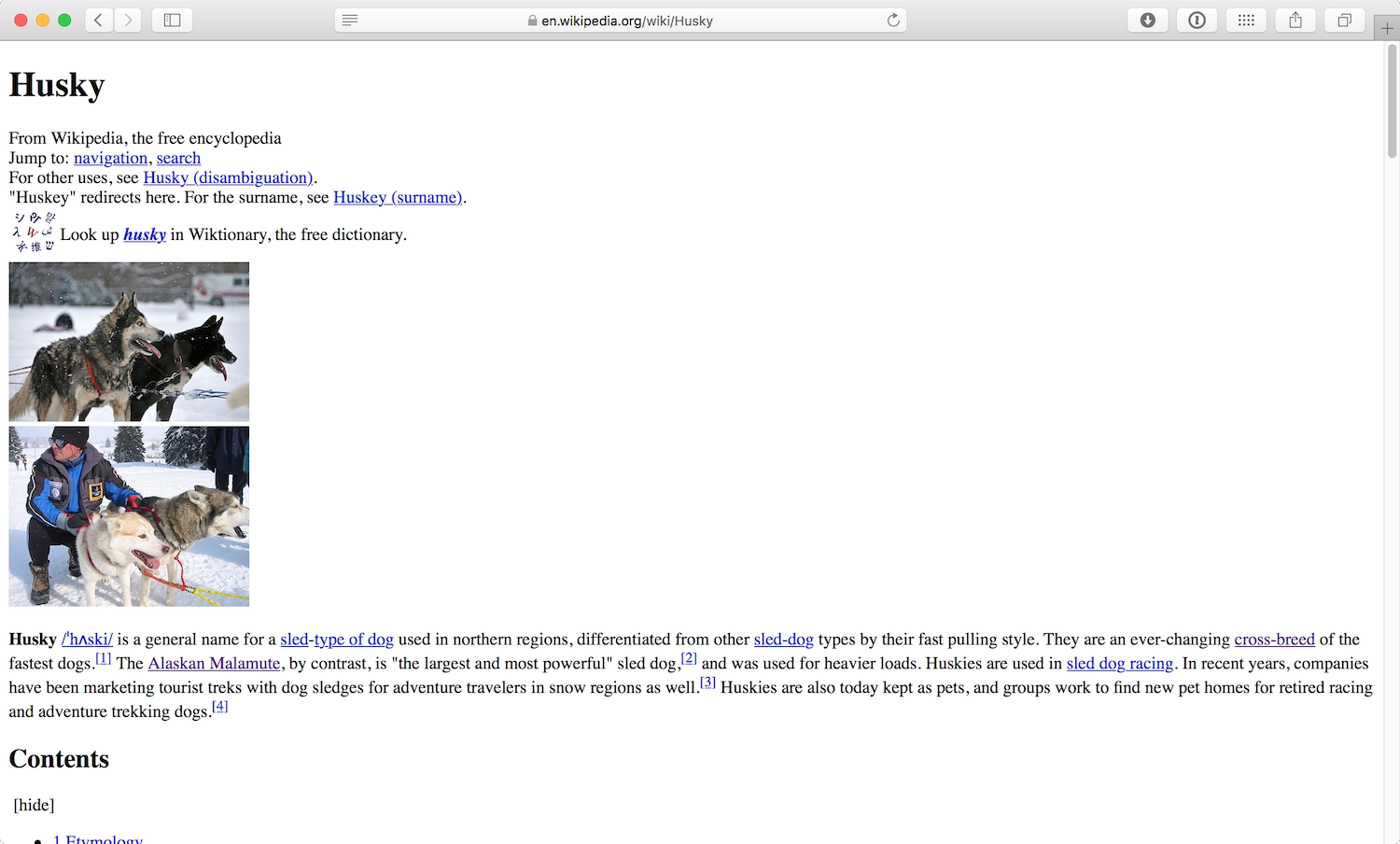
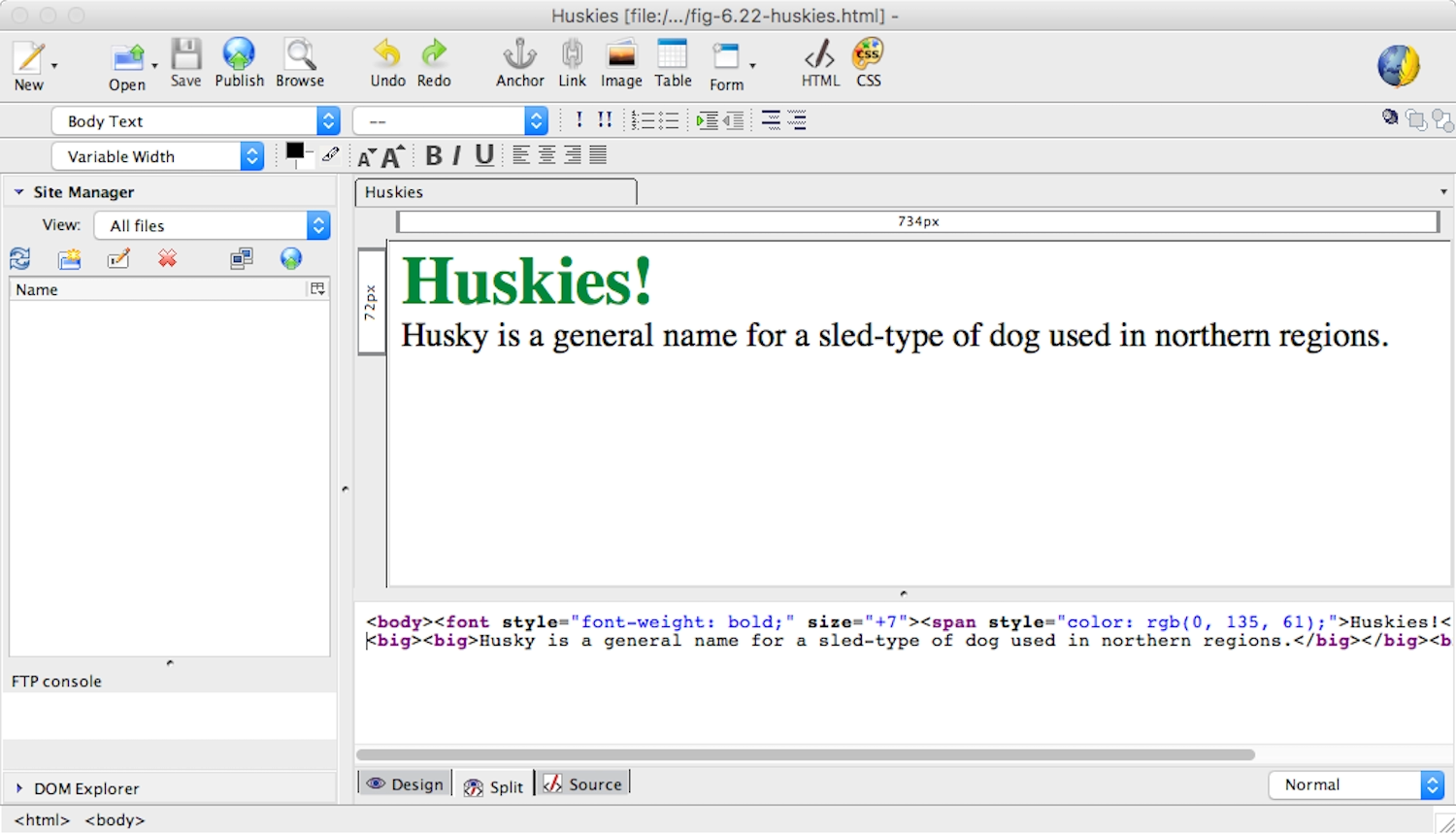
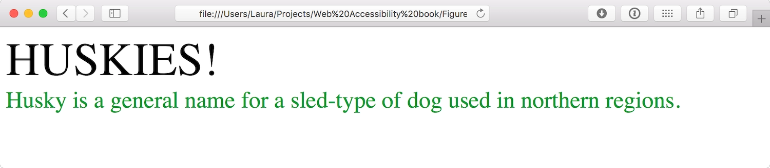
What-You-See-Is-What-You-Get (WYSIWYG) editing software outputs HTML from content created in a visual editing interface. Although they’ve improved enormously over the last ten years, WYSIWYG editors can still be used to commit HTML atrocities. The problem with WYSIWYG editors lies in the name: they’re designed to manipulate the appearance, not the structure, of the content. For example, if I wanted to make “Huskies!” into the title of my page, I would choose a big font size and a bright color to visually suggest its importance (Fig 5.20).
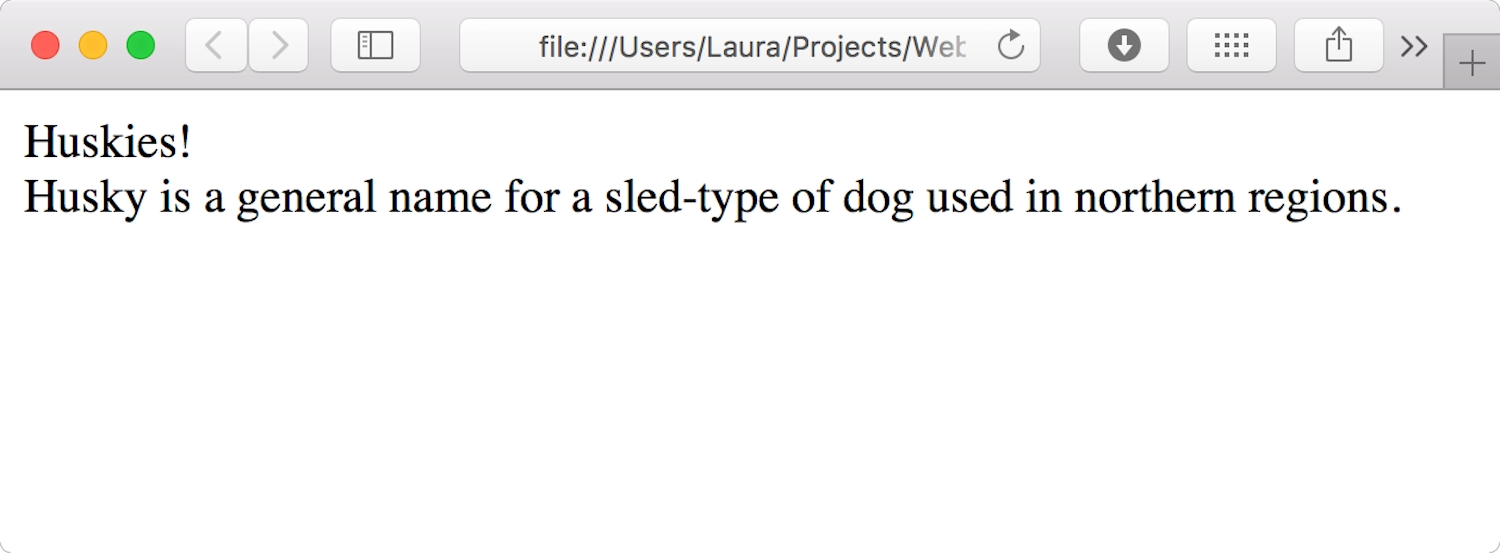
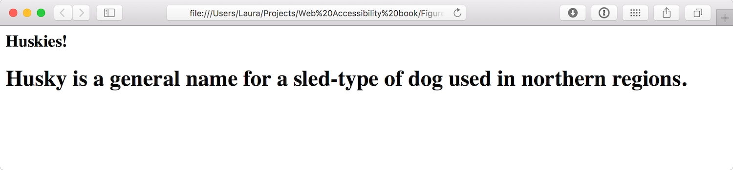
While making the text big and colorful makes it stand out to sighted users, it’s completely meaningless to a screen reader or a search engine. When they read the unstyled HTML, all they see is another chunk of body text, exactly the same as the text around it (Fig 5.21).
To make matters worse, many WYSIWYG editors generate unnecessary elements and attributes in their attempt to parse meaning from visual design choices. For example, the WYSIWYG editor KompoZer uses the <font> element whenever the font is made bigger, so the HTML ends up as:
<font style="font-weight: bold;" size="+7"><span style="color: rgb(0, 135, 61);">Huskies!</span></font>
<br>
<big><big>Husky is a general name for a sled-type of dog used in northern regions.</big></big>
<br>
<font> has been deprecated since HTML4. Don’t be like KompoZer.
CSS styling
The same problem occurs when HTML elements are chosen because of their associated CSS style rather than because of their structural meaning.
Consider a bit of text that has a main title—“Huskies!”—and a subtitle—“Husky is a general name for a sled-type of dog used in northern regions.” The hierarchy is very clear to sighted users (Fig 5.22).
When you look at the HTML and CSS, though, you see that the main title is in fact an h2 and the subtitle is an h1. They’ve only been chosen to mark up the content this way because of their visual presentation: the CSS has been written so that the h2 is big and uppercase, while the h1 is smaller and green. No wonder the h1 is being used as a subtitle.
<style>
.big-title {
display: block;
font-size: 4em;
text-transform: uppercase;
}

.green-subtitle {
color: #01953A;
display: block;
font-size: 2em;
}
</style>

<h2 class="big-title">Huskies!</h2>

<h1 class="green-subtitle">Husky is a general name for a sled-type of dog used in northern regions.</h1>
If you look at the same page without CSS, you can see how confusing the structure appears to screen readers and search engines (Fig 5.23).
Meaningful HTML
These two issues share a common root: a failure to separate structure and style. To ensure that content is meaningful to everyone—sighted users, screen readers, and search engines alike—a rigorous separation of structure and style is crucial.
HTML describes the structure and meaning of the content:
<h1>Huskies!</h1>

<h2>Husky is a general name for a sled-type of dog used in northern regions.</h2>
CSS shapes its visual appearance:
<style>
h1 {
font-size: 4em;
text-transform: uppercase;
}

h2 {
color: #01953A;
font-size: 2em;
}
</style>
Separating structure and style has the added bonus of making HTML and CSS easier to maintain. If branding changes at a later date and we decide that all titles should be blue instead of green, we can just change the style sheet. If we were using an old WYSIWYG editor, we’d have to go through every single title and change the colors individually. That simply doesn’t scale.
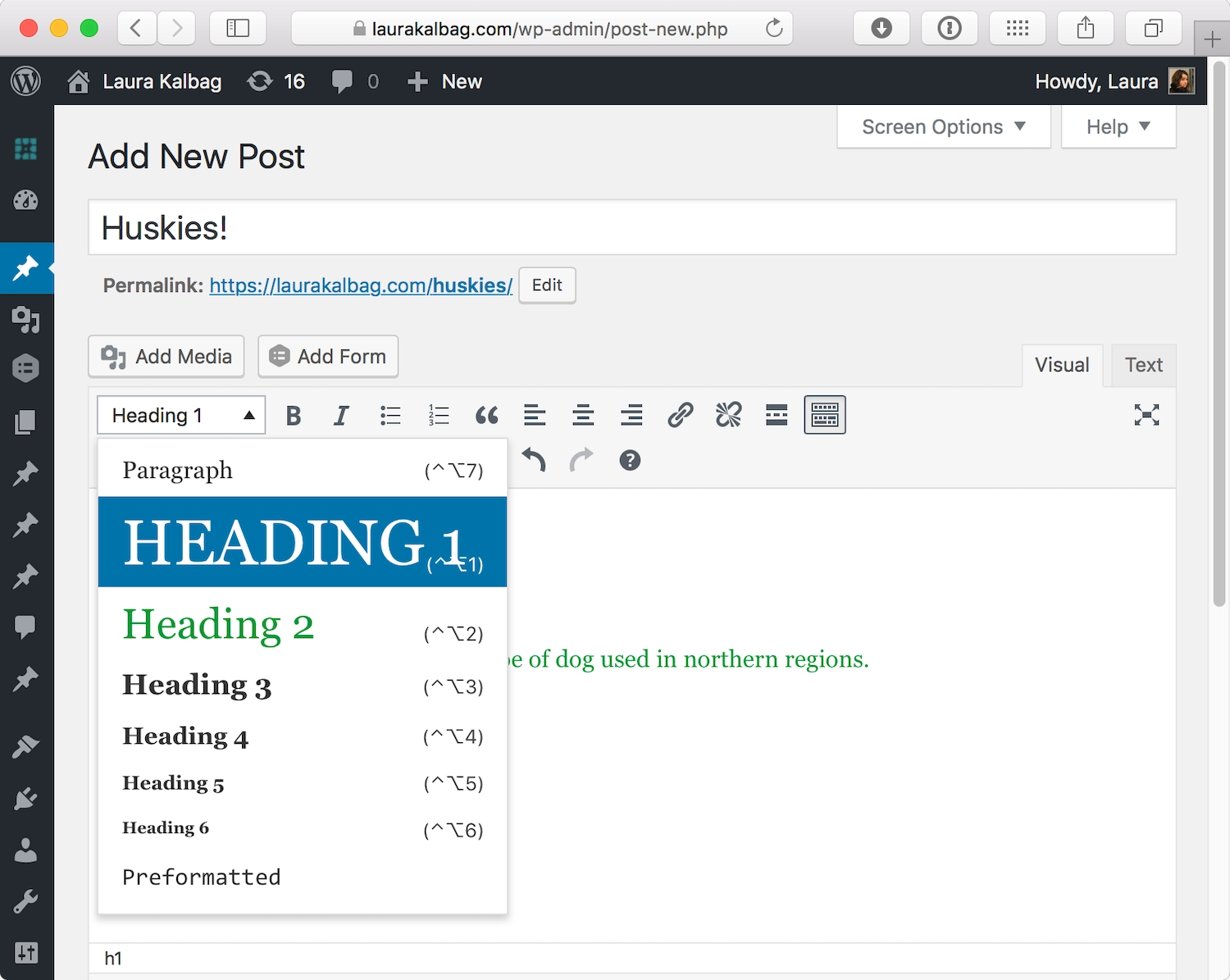
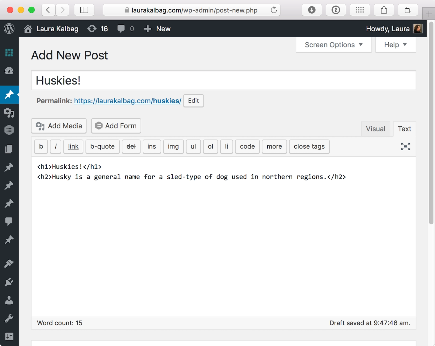
Fortunately, WYSIWYG editors have improved; many allow you to choose the structural element from a dropdown list (Fig 5.24) leading to more accurate and meaningful HTML output (Fig 5.25).
Even though a site’s HTML is usually created by a developer or generated by a content management system, this doesn’t mean we should blame the developer for badly formed HTML. With the previous examples, you can see how closely the structure of the HTML is linked to the roles of content strategy, copywriting, and search engine optimization. Sites are likely to be much more accessible if every team member understands the impact the markup has on the content they’re creating.
Alternative styles
In a world where we frequently access websites from different devices and browsers, and where pages adapt to fit a range of environments, it’s not surprising that some users want to customize a site to better suit their needs.
RSS readers and browser readability extensions take the structured content of a page and display it with custom styles. These readers and extensions focus on making content as readable as possible by using clean typography and hiding headers, footers, and ads (Fig 5.26). They usually allow people to set overarching preferences for all the pages they view.

Most RSS readers and readability extensions aren’t compatible with interactive pages and will strip out the visual information and behavior of interactive elements. Some extensions, such as Safari’s Reader, can only be enabled on pages that contain a significant amount of text in one block.
People may rely on alternative styles if they find a site hard to read or access. This can make a site more legible or appealing, but because alternative styles only affect a site’s CSS (not its structure or behavior) they can’t address greater usability issues. We still need to structure our content using meaningful HTML to ensure basic accessibility.
Progressive Enhancement and Graceful Degradation
Progressive enhancement (also sometimes known as adaptive design) defines a minimal experience acceptable on all devices and browsers. Enhancements that optimize the site—for particular technologies, viewport sizes, and sometimes devices—are then layered on top of that baseline. Crucially, these enhancements don’t affect access, ensuring that everyone—even those without fancy devices or the latest browsers—has a good, if basic, experience.
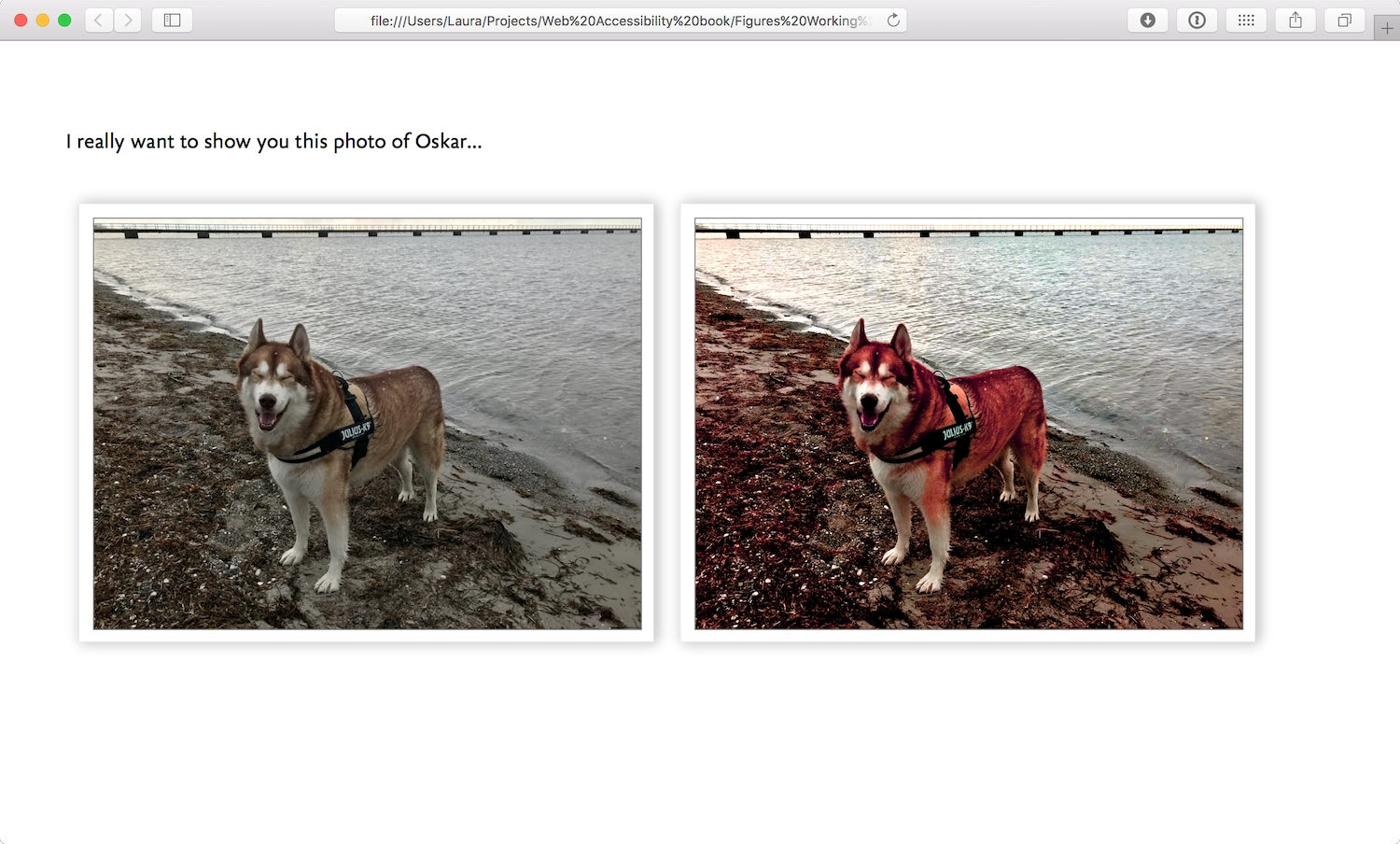
A simple example of progressive enhancement is adding background-blend-modes to images on a site. Browsers that don’t support CSS background-blend-mode won’t parse the blend effects on the images, but the visitor’s core experience isn’t affected by seeing the original non-blended images instead. Visitors using browsers that do support CSS background-blend-mode can have an enhanced experience (Fig 5.27).
A more complex example of progressive enhancement is when a simple interaction has a more complex interaction layered on top. I designed a responsive accessible HTML5 video player for Ind.ie based on Dennis Lembree’s accessible HTML5 video player (https://a4e.link/05/06/). The HTML for the video player just uses the HTML video tag, which plays the source video file with the native video player provided by the user’s operating system (Fig 5.28).
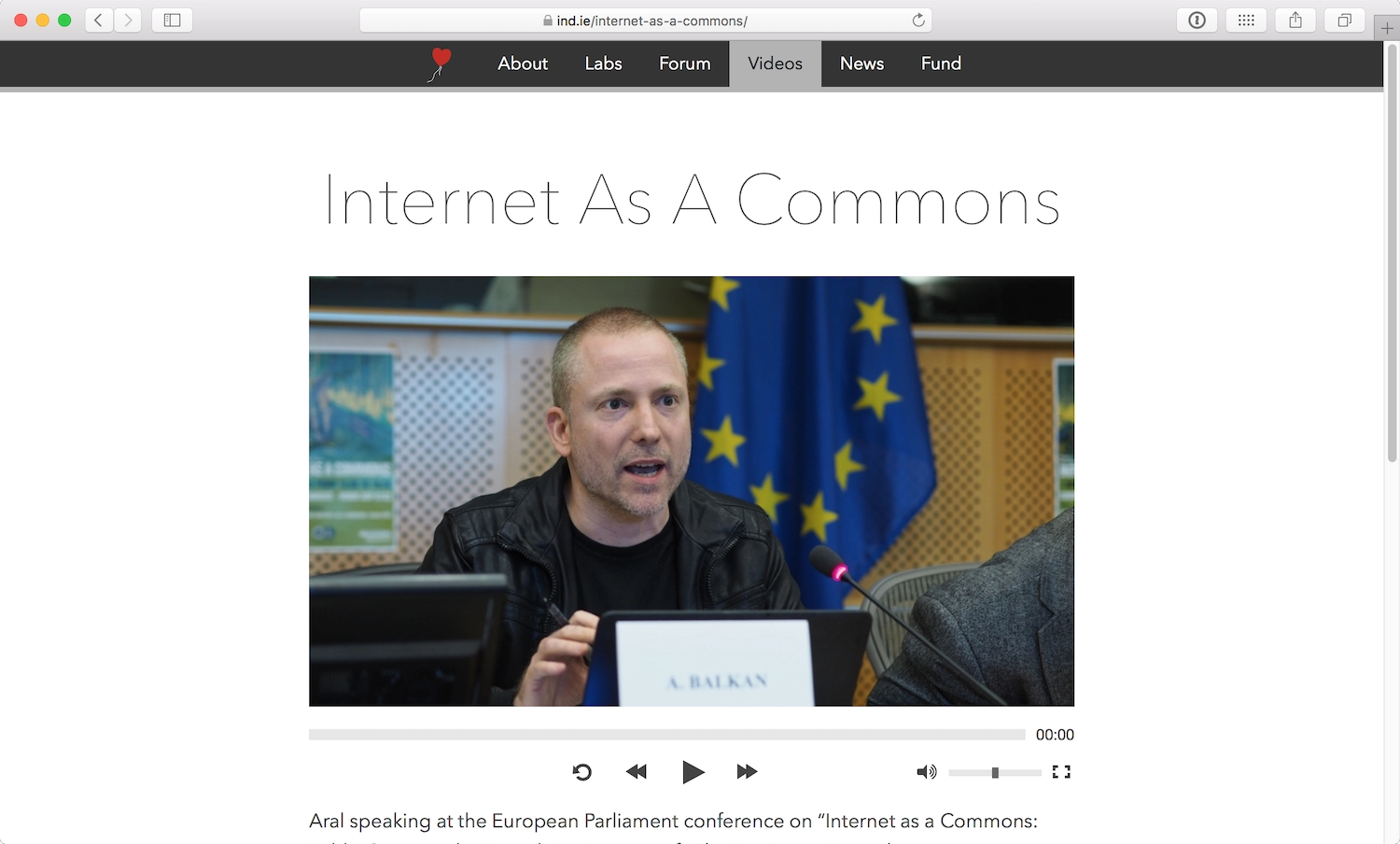
If JavaScript is enabled, a custom control panel replaces the controls of the native video player. These enhanced controls make the video player appear consistent across platforms and with the branding of the overall site, but aren’t necessary to operate the video player.
A related approach is graceful degradation, which might be considered the flip side of the progressive enhancement coin. Graceful degradation is the idea of building for the most capable browsers, and adding fallbacks for the less capable. It’s a concept borrowed from mechanical and electrical systems, designed so that when something goes wrong, the system doesn’t break completely—it just operates in a limited way.
Graceful degradation is often preferred for interaction-based sites and web apps where the primary experience of the site is built on complex behaviors rather than content. Progressive enhancement could be used to layer more complex interactions on top of simpler interactions—that is, for sites that couldn’t possibly fulfill their primary purpose without any interaction at all.
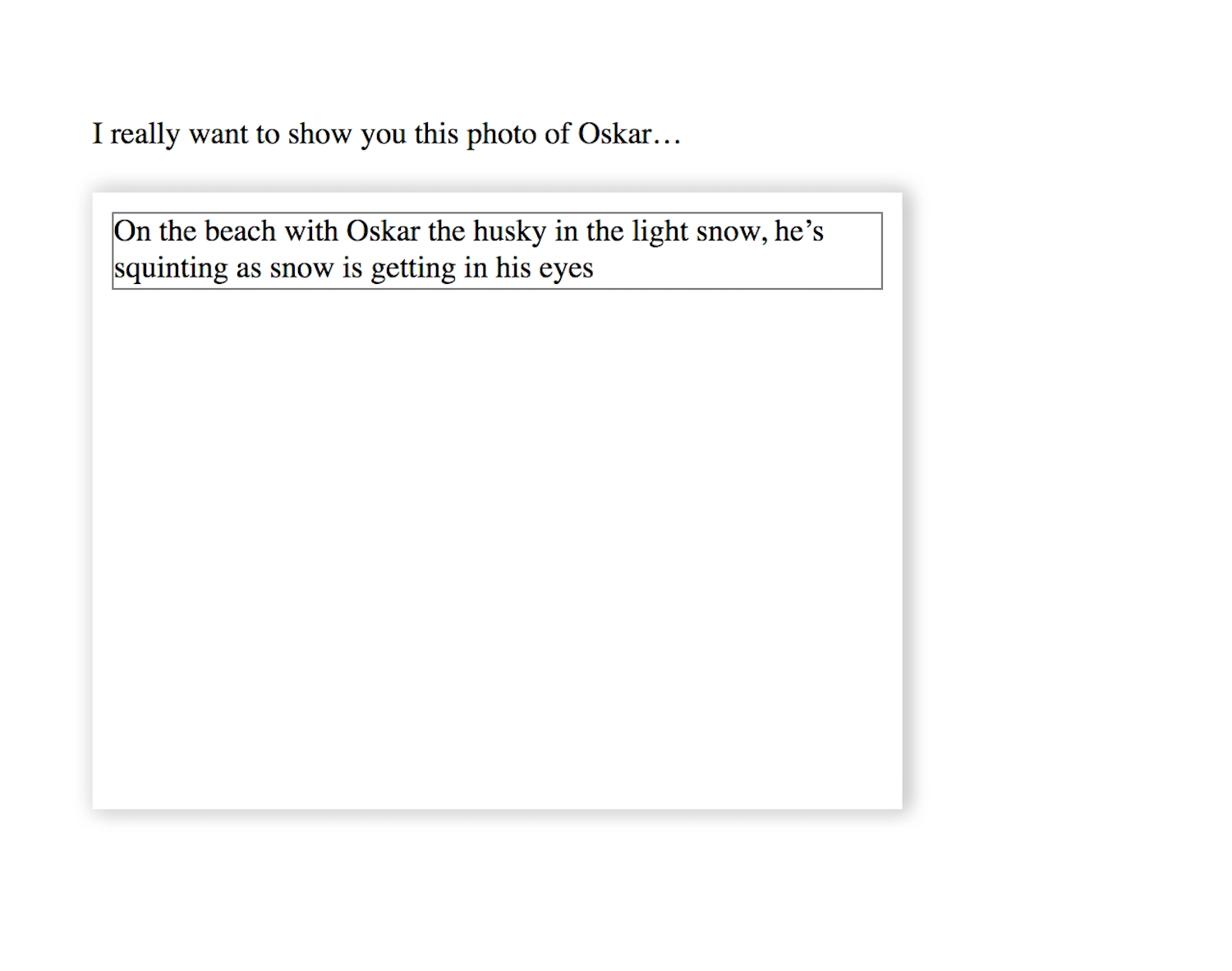
Graceful degradation is often used in conjunction with a list of supported browsers where the site must provide the best experience. Experiences in other browsers are considered adequate if the interactive elements provide the expected response and the text is readable. A basic example of graceful degradation is when an image falls back to show only the alt text (Fig 5.29). The experience may not be comparable, but it’s adequate.
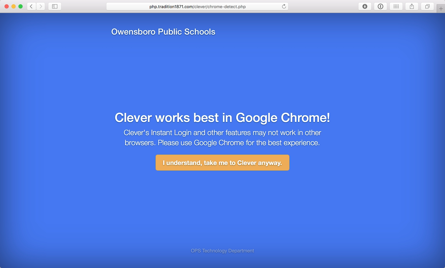
Sites that don’t provide a basic experience for all users often display an error message, telling the user to change or upgrade their browsers (Fig 5.30). Blocking visitors this way is generally considered lazy and bad practice. While it’s reasonable to assume that an interaction-heavy site won’t be able to support Internet Explorer 7, cross-browser support is a core part of building products for the modern web.
Progressive enhancement has gained favor over graceful degradation in recent years because the variety of devices and browsers has made it difficult, and unrealistic, to support only a small group of browsers. The capabilities of devices and browsers can differ wildly from one to the next, so layering feature support and enhancements on top of a baseline experience is the easiest way to make the best site for the widest audience.
WAI-ARIA
WAI-ARIA stands for Web Accessibility Initiative—Accessible Rich Internet Applications, but it’s often just referred to as “ARIA.” As web standards go, ARIA is pretty new —it’s only been a full-fledged web standard since March 2014. ARIA is particularly useful in conjunction with screen readers.
Complex web apps are trying to behave more like native desktop applications, and they make use of custom components or widgets to do that. These widgets allow for much richer interactions than just reading or clicking—think dragging and dropping content on the page or tracking video and audio progress using a progress bar. These complex components are usually accessible to developers in native desktop environments, but as web browsers and markup languages were originally designed with simpler, more document-based behavior in mind, browsers need extra help to understand how to make these features accessible.
WAI-ARIA allows these widgets to use different roles, states, and other properties to make it easier to describe their behavior in meaningful HTML, making them usable and recognizable by assistive technology. It also makes it possible to enhance the semantic information provided natively by HTML.
Roles
Most HTML elements have implicit roles that the browser exposes to assistive technologies as part of their default behavior. For example, an a has an implied role of link, which tells the assistive technology that this bit of HTML isn’t just text but an interactive element with all the clickability and varied states that come with being a link.
WAI-ARIA’s role (role=) is used as a layer on top of the existing markup language. It also helps define page structure, such as a navigation section. When an element receives focus, the screen reader understands the role this widget plays. This means the ARIA role given by the role attribute is prioritized by the browser over the implied role of the HTML element. For example, if you used a div with a role of alert, a screen reader would describe it as an alert rather than a div.
One way to understand when the role attribute should be used is when you’ve chosen to use a div element because the content isn’t appropriately described by any other HTML element. In this case, using role might make sense to make a plain old div more accessible:
<div role="alert">
<p>Your progress has been saved.</p>
</div>
There currently isn’t an HTML element for marking up a dialog box that doesn’t interrupt the user’s activity, though I’m crossing my fingers that dialog makes it into the HTML5.2 spec. For now, we can use role="alert" to give the div alert box behavior.
Other roles include dialog, status, and timer. There are many roles to use with straightforward, human-readable names—you can find a full list on the W3C website (https://a4e.link/05/07/). As when writing well-structured HTML, remember to double-check the expected meaning of the role before using it with an element.
Landmarks
Document landmarks are roles that help assistive technologies understand the role of a section and its relationship to other content on that page. Examples of document landmark roles include navigation and article (https://a4e.link/05/08/).
While document landmarks are useful for understanding a page’s structure, the idea is that you don’t need these landmarks if you’re already using HTML5 elements such as nav for navigation and article for an article. ARIA applied to these elements is just redundant. However, you’ll want to use document landmarks for Internet Explorer, as IE has yet to provide full accessibility support for these HTML5 elements. It’s worth checking Steve Faulkner’s HTML5 Accessibility page (https://a4e.link/05/09/) for information on current browser support.
States and properties
ARIA states and properties give further information about a widget to assistive technologies, thereby helping users understand how to interact with it. These states and properties are usually dynamic and can change throughout the use of the web application, most often manipulated with JavaScript. For example, the aria-expanded attribute might be used on a menu that expands and collapses and aria-describedby can tell assistive technology where to look for a description of an element.
In Inclusive Design Patterns, Heydon Pickering recommends using describedby so that assistive technology can see the connection between a password field and a password hint:
<label for="password">Choose a password</label>

<input type="text" id="password" aria-invalid="true" aria- describedby="password-hint">

<div id="password-hint">Your password must be at least 6 characters long</div>
Live regions
Live regions allow for live changes in documents to be announced without causing people to lose focus on their current activity. This means that those using the page can be informed of updates without losing their place within the content. Live regions might be used when content is updated, such as in a league table in sports, or when there’s a status update in a timeline stream.
The aria-live attribute is used to indicate when a widget has a live state, and how a screen reader should introduce changes in the widget to the user. Aria-live="off" means that a region isn’t currently live, and changes should not be announced. Aria-live="polite" signals that the update should be announced at the next graceful interval, such as when the user stops typing. Aria-live="assertive" indicates that the update should be announced to the user immediately:
<div aria-live="off">
<p>Next update: tomorrow at 12pm CEST.</p>
</div>

<div aria-live="polite">
<p>You have a new private message.</p>
</div>

<div aria-live="assertive">
<p>There’s a fire in the building. Please proceed calmly to the nearest emergency exit.</p>
</div>
The assertive property can be quite obtrusive, so it should only be used when people need to be informed of something immediately—such as an error or alert relevant to their current actions.
When to use ARIA (and when not to)
There are no negative side effects to using ARIA correctly, so even though there’s still patchy support in some browsers, you should use it as needed. However, ARIA should never be used to replace well-structured HTML. It should be your last resort.
ARIA only interacts with the accessibility layer of a browser, so it doesn’t provide the same inherent styles and behaviors that meaningful HTML provides. This also means that using ARIA won’t make an unusable website more accessible. As we’ve discussed, an unusable site is already an inaccessible site, so using ARIA with bad copy, poorly structured HTML, and a confusing layout will result in a confusing experience for assistive technologies. If you’re not sure if you need to use ARIA or not, the W3C has an easy guide for using ARIA in HTML (https://a4e.link/05/10/).
Show Your Work
Once our sites are built on a solid foundation of meaningful HTML, we’ve got the accessibility basics covered. It might seem complicated to make more complex components accessible, but accessibility standards and assistive technologies are evolving faster than ever before. Through building new components, testing them with real people, and sharing your work with other people in the web industry, you can help drive that progress.
We’re fortunate that our medium, the web, enables us to iterate on the products we make. Mistakes can be fixed, alternatives can be added, products can be refined, accessibility can always be improved. Evaluation and testing helps us find problems that need fixing and create strategies for improvements.