Content and Design
Design decisions made in the name of accessibility generally benefit everyone, because all technology is assistive. This is in fact the title of a wonderful essay by artist and design researcher Sara Hendren (https://a4e.link/04/01/), who reminds us that “all people, over the course of their lives, traffic between times of relative independence and dependence.”
Hendren asks, “What technology are you using that’s not assistive?” Our keyboards and mice assist us in communicating with a computer. Our headphones enable us to hear audio in our own spaces without disrupting those around us. Our phones give us the knowledge of the entire web in our pockets. Technology enables us all, and can give us a better experience of the world around us.
To improve the experience for everyone, we can focus on the usability of the web across four broad parameters:
- Visual: make it easy to see.
- Auditory: make it easy to hear.
- Motor: make it easy to interact with.
- Cognitive: make it easy to understand.
While these examples illustrate just a few benefits, they show that accessibility goals are also usability goals. Good accessibility is good usability.
Affordances and Conventions
Affordances are how objects suggest the interactions that can be performed with them—ideally in a way that’s recognizable by users. For example, when we turn on a new computer for the first time, we look for a button with the power icon. We expect a button because we’re accustomed to the on-off function of hardware operated by a physical input. We look for the power icon because it’s a conventional symbol used in electronics (Fig 4.1). Over time, these affordances become conventions we can rely on, both as designers and as users.

Usability can be compromised when designers abandon conventions because we’ve decided to “redefine” how something is usually done. Very occasionally, this can result in a new innovation that genuinely redefines and reshapes behavior, but it usually just makes a really unique mess (Fig 4.2).
On the web, using conventions well makes for a gentler learning curve for new visitors. A common convention is to design interactions using visual metaphors, to make the design imitate a similar real-world artifact. The most prevalent and successful use of a visual metaphor on the web is the button. Buttons trigger a behavior, such as submitting a form or changing a setting, because buttons in the physical space trigger behaviors, too, such as turning lights on and off. Browsers commonly use a simple three-dimensional appearance to give a button on the web an affordance that suggests, “Press me and I’ll respond” (Fig 4.3).

<button> in Safari, Firefox, and Google Chrome is rendered slightly differently depending on the browser’s default style, but they all look buttonesque.Alas, a visual metaphor can backfire if it looks like one object but performs like another. One of my pet peeves is when a link to another site is made to look like a button. The button style is usually chosen over a conventional link style to draw more attention to the link, but the conventional behavior of a button is to perform an action within the site, not to redirect the user to a different location. It’s like turning on your bedroom light only to find you’ve been teleported to your kitchen (Fig 4.4).
Affordances and conventions should inform the design and content of your sites. Content could be text, images, video, audio, or interactive experiences. Ensuring that it’s all designed to be usable and accessible is paramount—starting with how the user finds their way around the content.
Navigation and Wayfinding
Without a strong information architecture, people can easily get lost. We need to provide consistent ways to help people find content and determine where they are, regardless of what page they’re visiting and their position on that page.
Navigation bar
Most sites use a navigation bar at the top of the page that contains a list of links to a site’s main areas. You’ll find many forms of navigation on the web, but this is probably the most common. However, the navigation bar doesn’t just provide a means to travel around your site—it can also provide a summary of what a visitor can expect to find (Fig 4.5).
Subnavigation bars, sidebars, and footers also provide visitors with a better idea of what’s available on your site. However, it’s difficult to rely on these navigation patterns as they’re not consistent from one site to another and people may not always understand where to look.
When the navigation reflects the information architecture of your site, it gives people a better understanding of where they need to go and offers a preview of other information they might find relevant or interesting. Navigation bars work best when they offer a brief snapshot; they become unwieldy if the list of links they contain is too long.
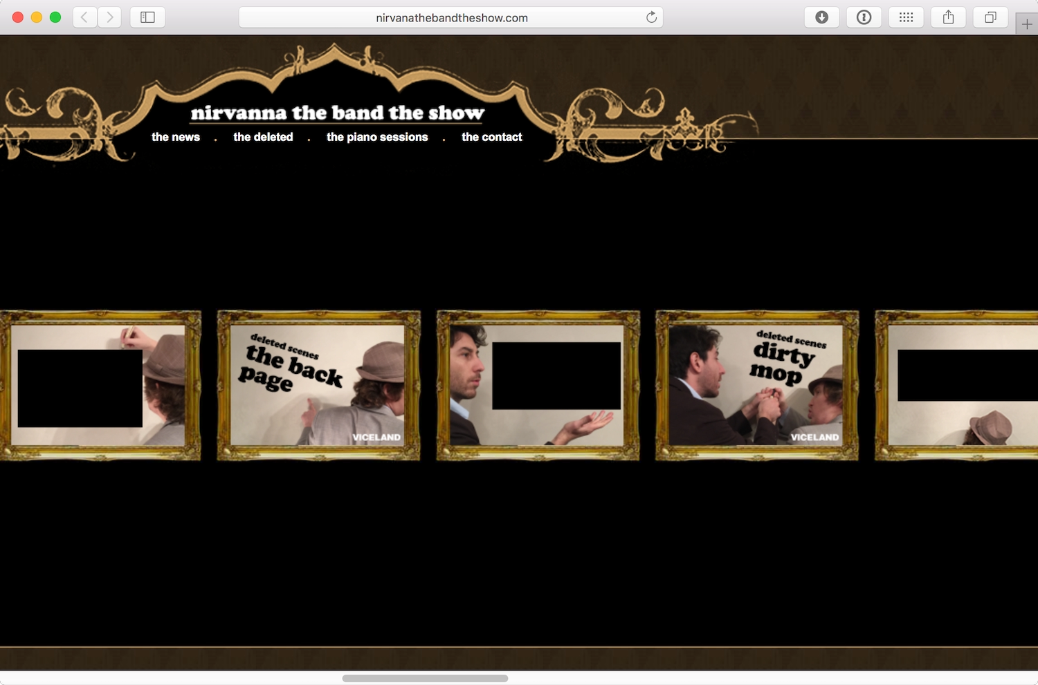
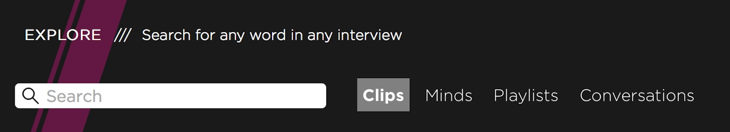
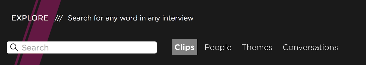
Once we’ve established what you want to include in your navigation elements, we can consider the text for each link. With usability in mind, and to paraphrase Steve Krug’s Don’t Make Me Think!, we’ve learned it’s best to make navigation descriptive and concise. It’s hard for a new visitor to understand what to expect from a site archiving interviews about the games industry when the navigation lists “Clips, Minds, Playlists, Conversations” (Fig 4.6). When we use terminology that’s easy to understand, more visitors will be able to find what they want (Fig 4.7).
Mystery meat
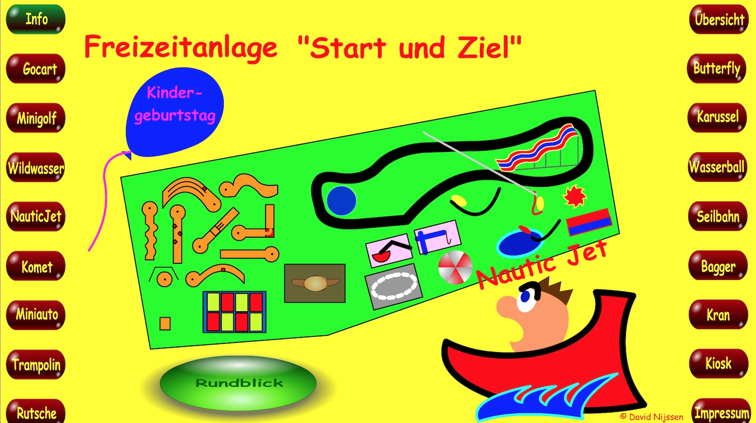
Every now and again, I come across an “alternative” navigation where a designer has decided they can subvert existing conventions and provide someone with a whole new experience (Fig 4.8). Unfortunately, these experiences often don’t succeed because deciphering the navigation proves too bothersome. People would rather spend their time elsewhere.
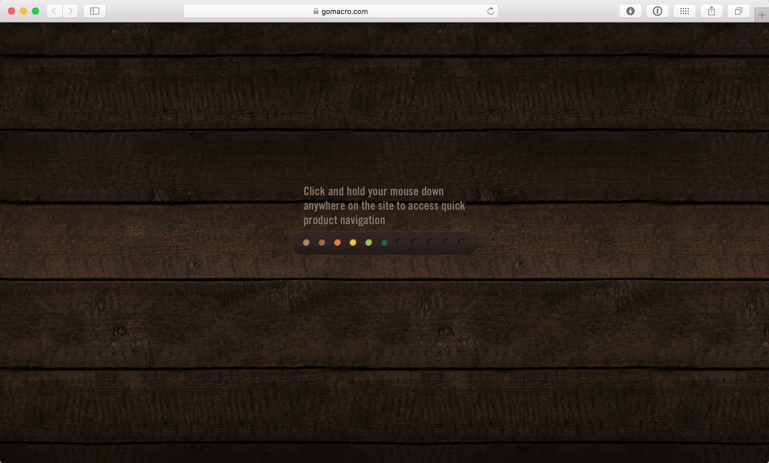
Back in the heyday of Adobe Flash, there was a lot of experimentation around navigation using hovering, dragging, and some kind of logic puzzle you had to solve to navigate the site. While I’m not averse to experimentation and innovation—we all want to make better web experiences—you’d need to have an extraordinarily good reason as to why existing conventions don’t work for your site if you insist on going that route (Fig 4.9).
If your navigation needs an explanation, you should probably rethink it—and consider returning to well-established conventions.
Titles and breadcrumbs
Another role of navigation is orientation—helping someone determine where they are. Search results often bring people to an internal page on a site that’s not listed in the main navigation elements. A visitor’s first stop when identifying where they are on a site is usually the page title. A highlighted or “active” style in the navigation can also help people understand where they are. (Fig 4.10).
On large sites, breadcrumbs are often used to help visitors understand the relationship between the page they’re viewing and other areas of the site (Fig 4.11). Breadcrumbs can be particularly valuable to people who have difficulty remembering where they’ve been or what they’re trying to accomplish.
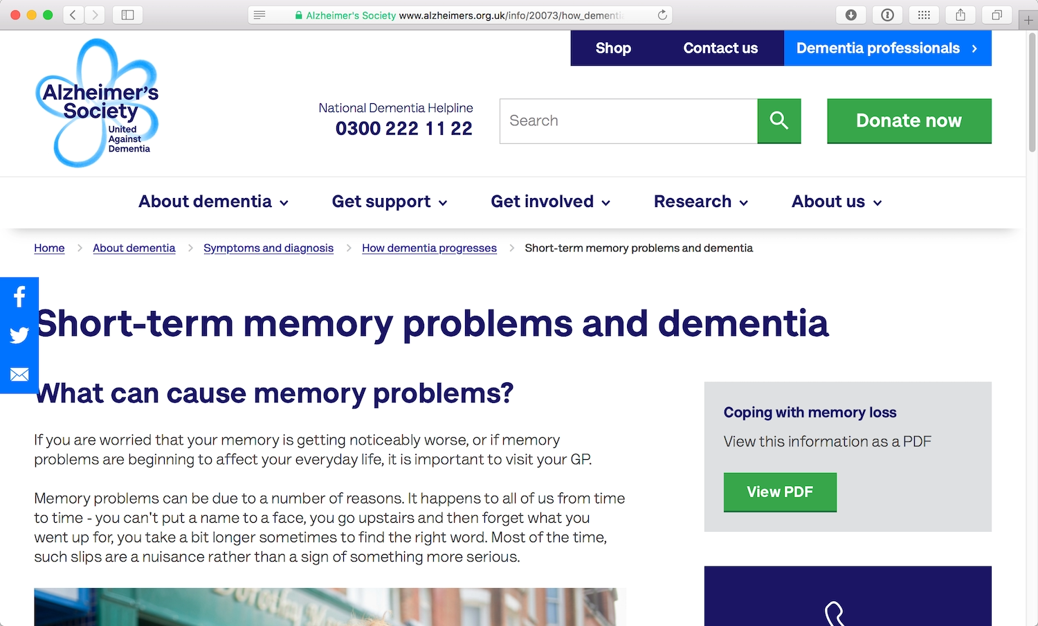
When I worked with the Alzheimer’s Society on a responsive redesign of their site, we paid particular attention to the navigation. Research and usability testing on their site indicated that breadcrumbs were especially valuable to visitors who had symptoms of dementia, including memory loss and confusion. But, again, all audiences benefit from clear wayfinding signals that orient them within a site.
Links
Links are as old as the web, so long-standing conventions and standards have developed around them. Most browsers render links in blue text with an underline by default. If the link has been visited before, the text appears purple (Fig 4.12).
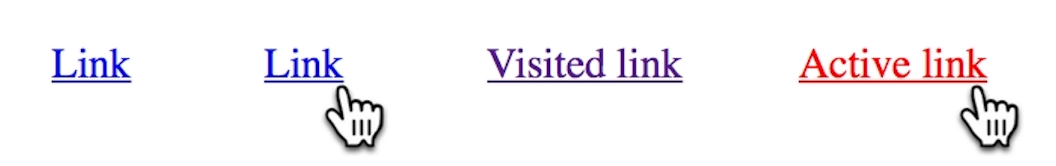
These common styles make links easy to recognize on a page. Over the years, fewer sites have stuck to the blue color standard, but most still use the underline to distinguish a link from non-interactive text. The contrast between link text and regular text is the key consideration. Finding links in a body of text shouldn’t be a cruel game where the reader has to hover over every word to find them.
Two years ago, Google decided to drop the underlined style in their links (https://a4e.link/04/03/). The lack of underlines makes the page layout appear much cleaner and the text slightly easier to read (Fig 4.13).
Making a change this significant was a big deal for Google: they could lose a lot of page clicks—one of their sources of income—if people couldn’t distinguish the links from the rest of the text. However, Google’s other design decisions ensured they stuck with enough conventions to keep the links obvious:
- bright blue link color, consistent with many other sites
- underline visible on hover
- visible URL on every search result item
Link language
I mentioned earlier that screen readers can jump between links on a page. Navigating through a page full of links using a screen reader can be tiresome—or worse, useless. “Click here, click here, click here” is often all you’ll hear.
The “click here” repetition is a common issue caused by nondescript link text (Fig 4.14). This often crops up in sentences ending with a call to action, such as “To get in contact with our team, click here.”
The problem is that using “click here” as the language for your links renders the links meaningless for those with screen readers as well as those without. Descriptive linking, instead, helps links make sense out of context, and provides users with a sense of where the link will take them or what will happen after they click. “Read the full article” is a lot more descriptive than “Click here.”
Descriptive linking also helps simplify your writing. “To get in contact with our team, click here” can be simplified to “Get in contact with our team.” Or: “Last week we posted a review of Murder in The Clouds. You can read that review here” can be simplified to “Last week we posted a review of Murder in The Clouds.”
Writing this way takes practice, but your readers (and listeners) will thank you for it.
Writing
Writing great copy comprises more than good spelling, grammar, and text in a coherent order. The best sites have content that is understandable, useful, and appropriate for its audience.
Hierarchy and structure
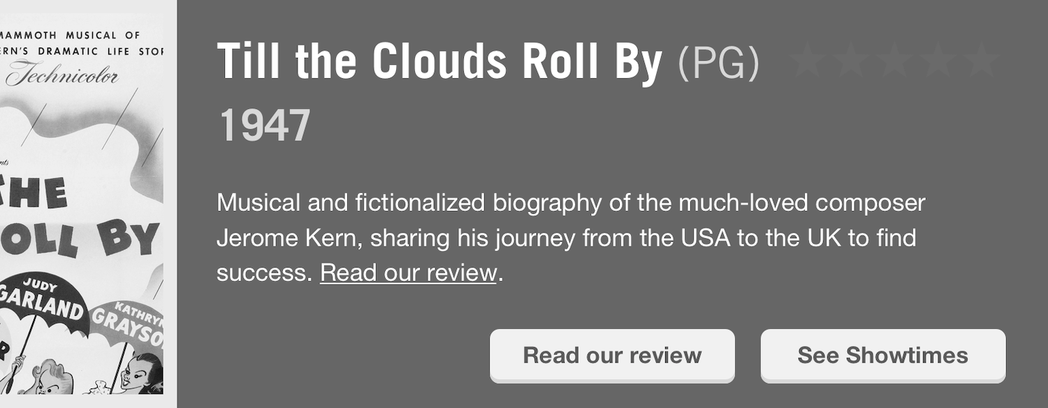
Accessible content begins with well-structured copy. At the page level, structure helps readers understand which text on a page is most important. Using clear and concise headings makes it easy for someone to skim the page and understand the information they’re likely to find (Fig 4.15).
If your text contains lists, separate them out from paragraph text to make them clear. The different structure will also break up the page, providing space for the reader to rest (Fig 4.16).
A well-structured and easily navigable page also looks less intimidating. For someone who struggles to read and understand text, a clear content hierarchy could be the difference between wanting to read a page or closing the browser tab because the page doesn’t look worth the effort.
Long lines of text can be hard to read, as readers may struggle to read continuously without a break, sometimes finding it hard to remember what they read at the beginning of the sentence. Punctuation can help break sentences into smaller chunks, but short sentences are much easier to read.
Everyone can benefit from short, easy-to-read sentences and well-structured page content. Take my brother Sam, for example. Reading requires a lot of concentration for him, so Sam tends to read in short bursts, returning to the same page multiple times. Content that is split into a clear hierarchy, with obvious headings, helps him easily return to his previous place.
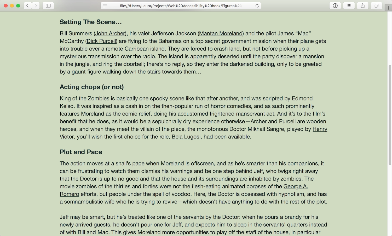
His ideal text format is the small bits of trivia presented on the IMDb (Internet Movie Database) website, because they’re relatively easy for him to memorize. The IMDb movie pages are well-structured, with clearly bordered sections and large bold titles. Visual cues like hyperlinks help Sam quickly find related content. Similarities in layout from one page to another help him remember the area of the page where he’ll find the information he wants without having to read everything else on the page first—for instance, he knows he will always find the “Storyline” below the “Cast List” on an IMDb movie page (Fig 4.17).
Plain language
Clear, simple, and concise language makes the most accessible text. Concise writing comes with practice, and makes text much easier to read. I’m terrible at being concise, and always use more words than needed (as the editors of this book will attest!). I’ve found that Twitter is a great place to practice concise writing—I often rewrite tweets again and again to make them fit inside the character restriction.
Terminology can be hard to get right. Usually it’s best to avoid being too technical. What are the chances that the average person on the street even knows what a “browser” is? Some don’t even consider the name of the app they’re using, but focus on the job it does: “I use the web program” or “I use the internet button.”
Similarly, jargon should be avoided. Have you ever had a conversation with someone who uses an acronym for every other word? If the reader isn’t familiar with the meaning of the acronym or abbreviation, they can lose any understanding of the text: “Please get this GRN to AP ASAP for the COO.”
In other contexts, acronyms can be okay—even necessary. For example, if you started talking about “Hypertext Markup Language and Cascading Style Sheets,” fewer web industry folks would understand you than if you said “HTML and CSS.” Just in case, it’s best to include the meaning of the acronym or abbreviation the first time you use it on a page: “We make websites using Hypertext Markup Language (HTML) and Cascading Style Sheets (CSS). HTML gives our content structure; CSS gives it style.”
Using vague terms with unclear meaning creates similar problems. “Blue-sky thinking” is the kind of language that conjures up awful business stock photos. When in doubt, say something as plainly as possible. “Creative thinking” makes you sound less foolish anyway.
Typography
Once you have a visual hierarchy in place, with headings, paragraphs, lists, and emphases, you can use typography to further enhance the readability of the text. Accessibility lies in keeping the text as legible as possible—and the font family, size, and line height you choose has an impact.
- Font size: If small text can be hard to read, overly big text can pose problems, too, forcing you to sit back to be able to read at a comfortable distance. Ample font sizes help as many people as possible read your text. The generally recommended font size is the equivalent of 16 pixels or larger, but this of course depends on the font.
- Font weight: Thin type became more popular when high-resolution screens became more prevalent. But thin type can be hard to read as it has a lower contrast against the background than heavier type does. It’s also rendered very differently on standard and high-resolution displays—it loses clarity at standard resolution—so it’s important to take care when using it, particularly at small sizes.
- Line length: Text crowded on to a short line length can be difficult to read because the text is broken up into such small groups. When a line is longer than about 66 characters (http://webtypography.net/2.1.2), you can find yourself having to turn your head from side to side to read the text, or getting sore eyes. Finding a balanced line length will make a big difference to people with difficulty reading.
Jason Santa Maria’s On Web Typography (https://a4e.link/04/04/) and Richard Rutter’s recent Web Typography (https://a4e.link/04/05/) both contain a wealth of information on choosing fonts and arranging type. As with general usability, thoughtful typography will benefit everyone.
Specialist typefaces
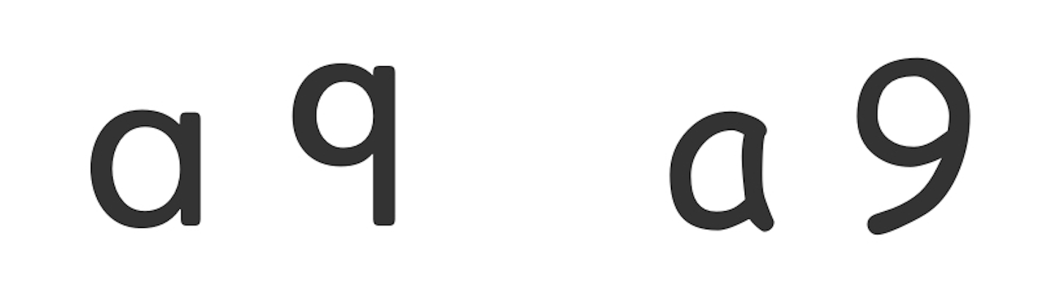
There are specialist typefaces designed to aid young readers and people who have difficulty reading. Heinemann is an unfussy typeface that uses the same shapes for characters as many people are taught to write in school: the a, for instance, has a single story and a large round counter (the white space in the center of the shape) (Fig 4.18). Its numeral 9 has a straight stem (or main stroke) rather than a curved stem, which some claim is more legible. The oft-maligned Comic Sans, looked down on by many designers, shares some of Heinemann’s simple letterforms, and so is often favored for signs and displays in classrooms (Fig 4.18).
Icon fonts
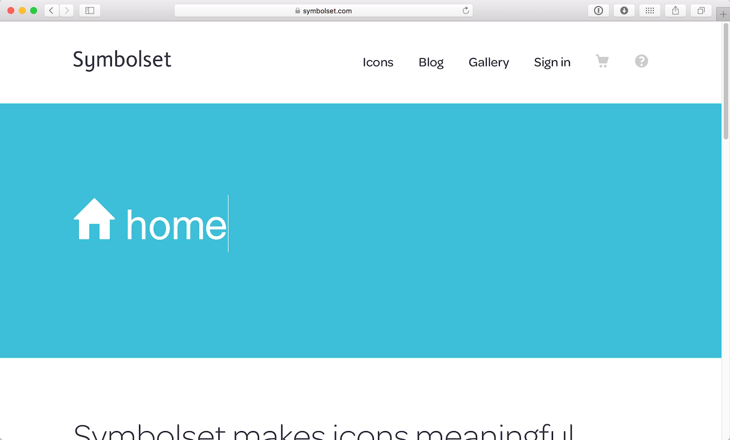
Fonts have become widely used for icons too. However, icon fonts can cause problems for accessibility, depending on their implementation. If the icon is mapped to an unrecognized glyph in the HTML, a screen reader will just ignore it (Fig 4.19). Some icon fonts map icons to whole words, which can work very well if, for example, your house icon reads as “home” in the HTML (Fig 4.20).
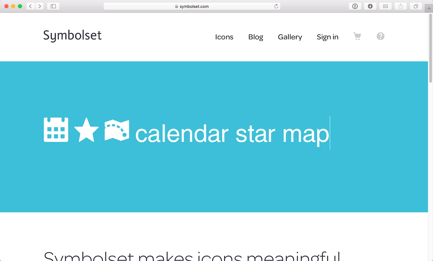
However, these icon fonts rely on your using the symbols for the correct words in the font. Deciding to use the star symbol to mean “favorite” when the font uses it to mean “star” could result in screen readers uttering some odd-sounding language: “calendar, star, map” (Fig 4.21).
As with all frameworks and libraries, don’t assume that because an icon font is widely-used, it’s a best practice. If you choose to use icon fonts, be cautious to ensure you are not compromising accessibility. Use progressive enhancement so your icon fonts fall back to accessible text. (We’ll look more at progressive enhancement in the next chapter.)
Font resizing
With the advent of mobile devices, readers often use the pinch gesture to zoom into text, making it bigger and easier to read on smaller screens. However, developers often disable zoom to gain greater control over the page layout resulting in an irritatingly common accessibility problem. To disable zoom, some developers use the viewport meta tag in the head element of their web pages:
<meta name="viewport" content="width=device-width, initial-scale=1.0, maximum-scale=1.0, user-scalable=no">
But if people find the text too small to read, using user-scalable=no and maximum-scale=1.0 as options for the meta viewport could render your site inaccessible. You can safely leave these attributes out, and opt for the much cleaner:
<meta name="viewport" content="width=device-width, initial-scale=1.0">
Interaction Design
People with learning difficulties and other cognitive impairments often find changes in content, following instructions, and entering an expected input challenging. Interfaces should allow users time to digest a page. When something goes wrong with an interaction, it should be easy to rectify any mistakes. If the page updates without user input, the changes should be identifiable and with a clear purpose.
Carousels and other animations often auto-advance content. Auto-advancing doesn’t allow someone to finish reading content if they have difficulties, or if they’re distracted. If you really must use a carousel, give visitors control over when the next slide advances. If you want to use a cool animation to aid somebody’s understanding, make sure it’s not so fast that it gets missed and not so slow that it gets in the way. Again, give users control so they can stop or skip animations.
When we require visitors to input content, we shouldn’t allow the page to time-out without warning. If this is a security concern, give people the option to customize the timing to suit their needs. People should be allowed to take their time. Allow people to retrace their steps to review what they’ve entered earlier. This can help people who need to refresh their memory, particularly if they have cognitive impairments that can affect memory.
Forms
Forms are the key elements in interactive sites—they are, after all, how a user communicates with a site. But even filling out the shortest form can be taxing for people with learning difficulties. Form interactions should be made as stress-free as possible, assisting the user in filling out the form easily and accurately. People with literacy or language difficulties, for example, can benefit from spelling and grammar checks inside forms. Predictive text in search forms can assist people who have trouble spelling search terms correctly.
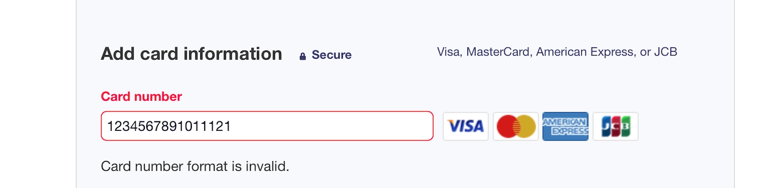
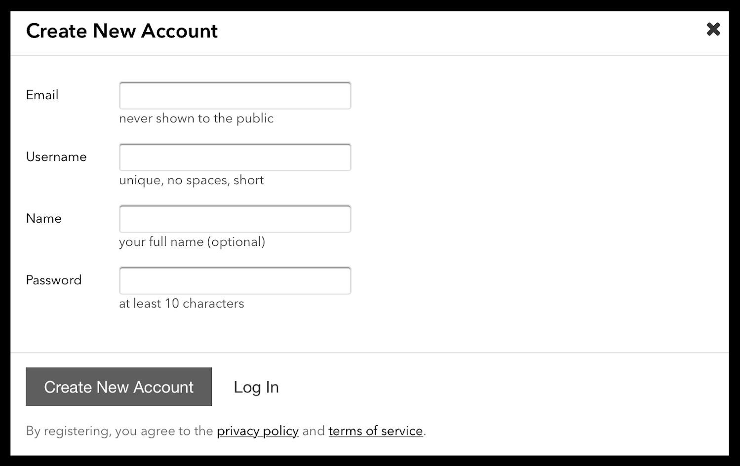
We’ve all been there: a form returns an error because what we’ve entered is in an “incorrect format,” or the form field requires a specific format (Fig 4.22).
But that’s not a user error—that’s the site developers’ fault. Formatting the content of an input field should not be a burden placed on the user; the burden should be on the developers to convert user input into the necessary format.
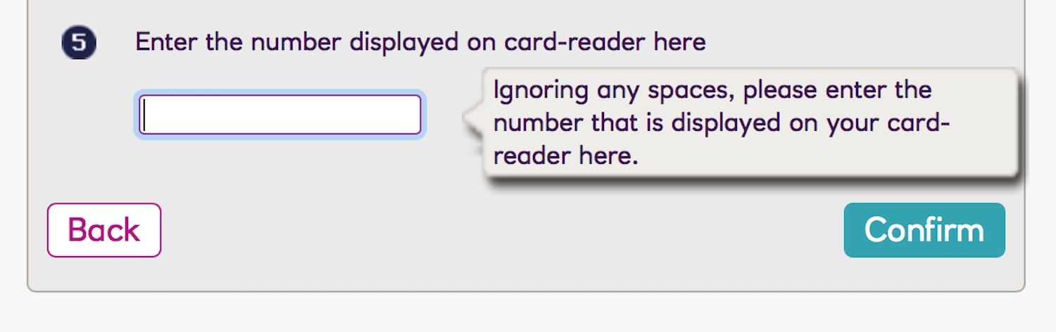
An input field should be constructed in a way that helps people enter the appropriate format. This could be through a JavaScript helper that converts their entry into the correct format on the fly (Fig 4.23), or even just microcopy clearly explaining the required format alongside the form field. (Fig 4.24). Asynchronous validation can also reassure people that their input is correct, resulting in a successful form submission.
If format conversion or asynchronous validation aren’t possible, the contents of the form field should be converted after the form is submitted into the format needed by the site. That way the people using the site aren’t unnecessarily challenged with working out the format required for their entries.
Alerts
Rich web applications have become more popular since the early 2000s, as the web has become more capable of providing interactive experiences. But rich web apps have introduced new accessibility issues: content on a page can change without being triggered by visitors. When an alert appears on a page without a page refresh, visitors need to have their attention drawn to that change.
We often use contrasting boxes near the top of the viewport for alerts, instantly capturing sighted people’s attention. However, those using screen readers also need a cue to tell them that the state has changed (Fig 4.25).
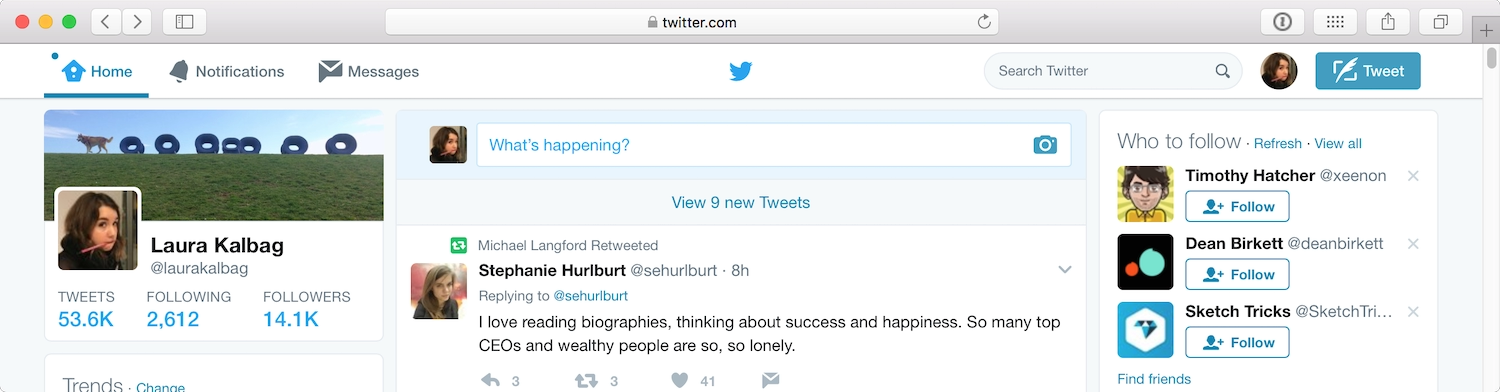
The alert should be given focus, alerting the user to the state change. Twitter does this very well. When a person using a screen reader views a Twitter feed, an instant alert announces: “New tweets available. Press period to review them.” The Twitter alert doesn’t just give you the changed state, but also gives you a keyboard shortcut to access those changes (Fig 4.26).
Once people have interacted with an alert, they should be able to return to their original position on the page.
Error messages
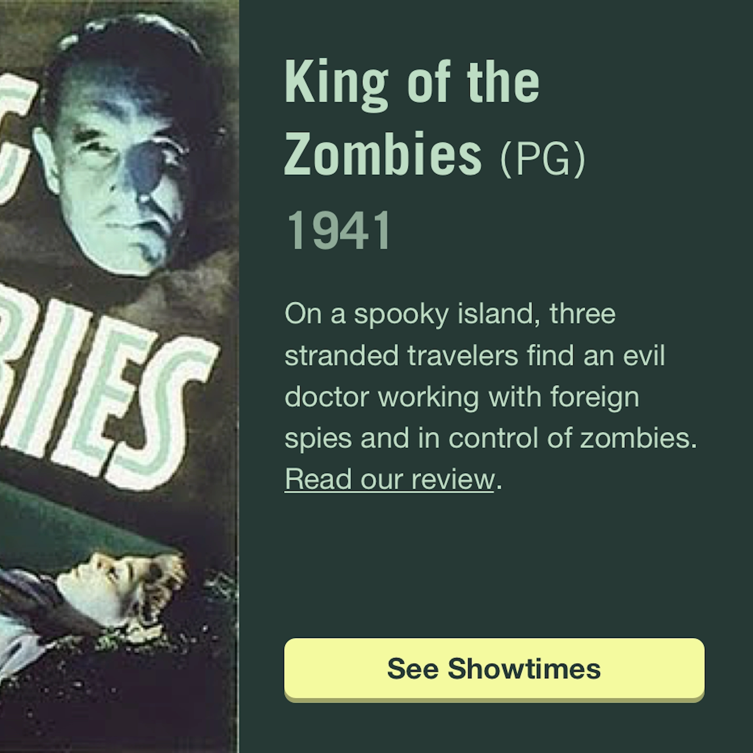
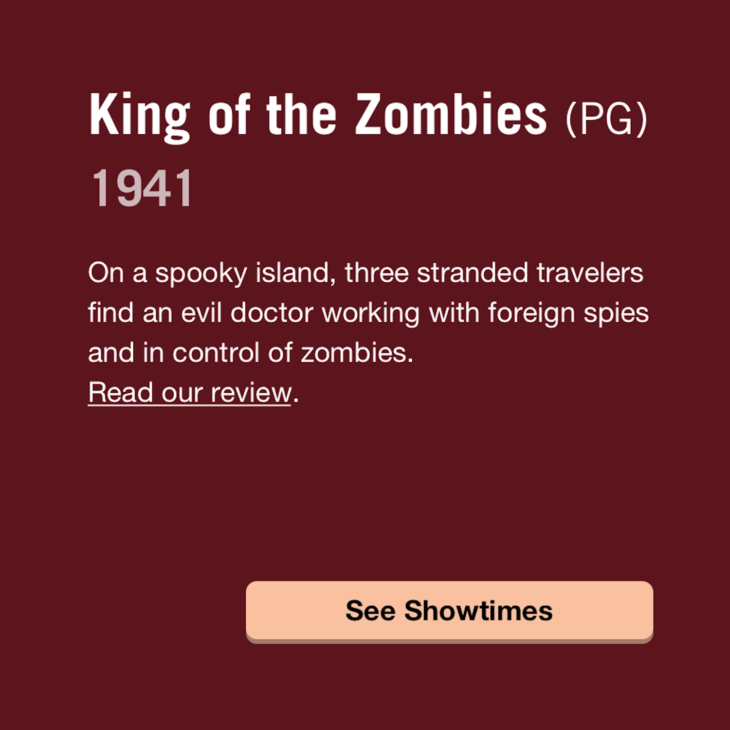
There are many different types of error messages: error messages on forms as the result of an interaction gone wrong; or even a simple “Page Not Found.” Error messages can either fix a problem, or confuse and frustrate us. These little chunks of text attract visitors’ attention, so making sure that the copy is friendly, appropriate, and useful is effort well spent (Fig 4.27).
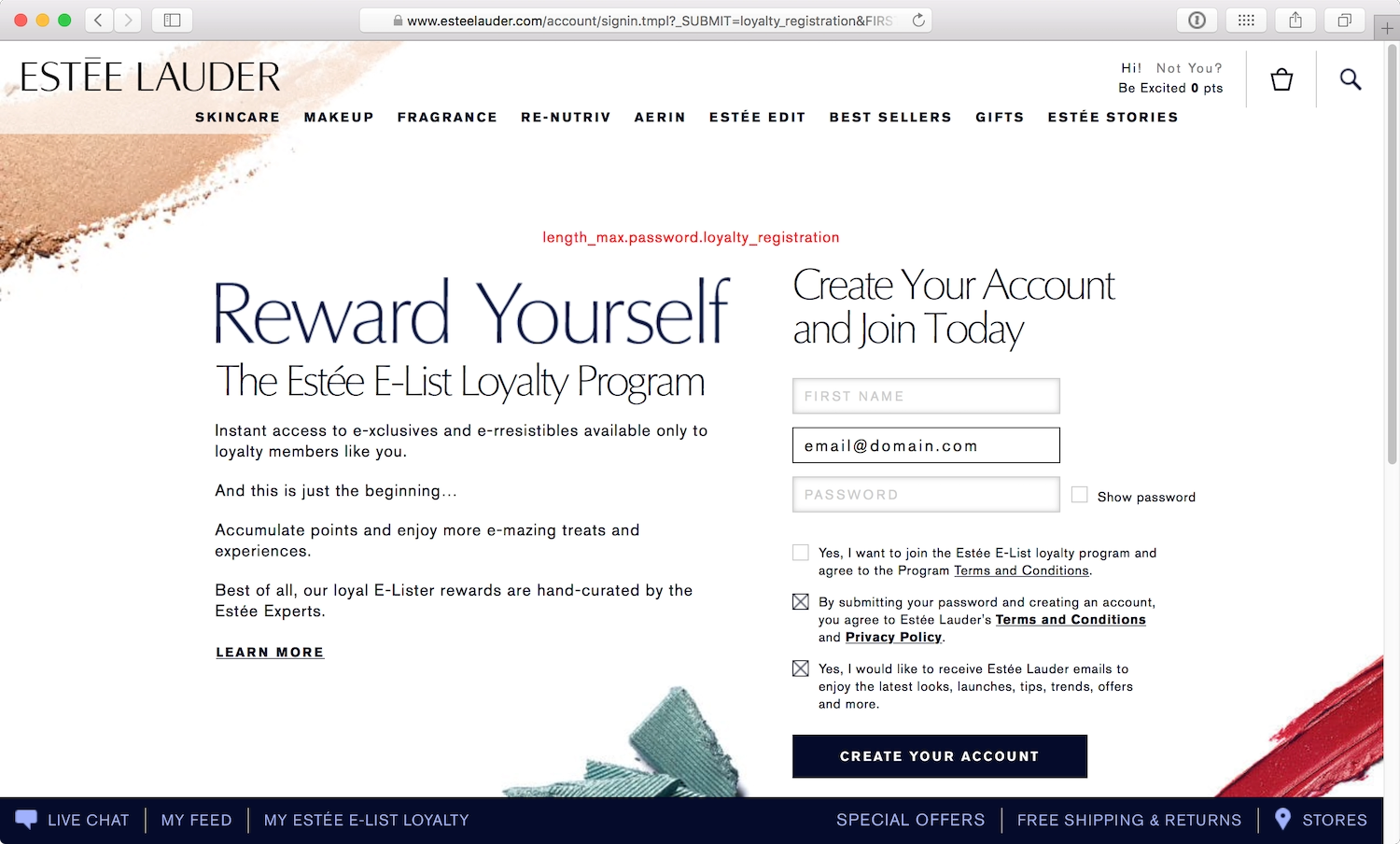
Sometimes these snippets of text are written by developers who are just passing on the error from the server, forgetting that there’s a human being on the other side (Fig 4.28).
If the user has done something wrong, explain clearly how they can rectify or get around the error (Fig 4.29).
Everyone on the team is responsible for creating a good experience for the people visiting their site. “Human copy” goes a long way in helping someone understand a problem, and how to fix it.
Color
In Chapter 2, we learned about how different types of color blindness affect how people perceive colors on sites. But color is more than a decorative choice; we use color to create a particular atmosphere or draw attention to specific elements on a page. In different cultures, colors may also take on different meanings, such as those associated with political parties or gender stereotypes. Color is never an arbitrary choice, and can easily be the downfall or success of your accessible design.
Contrast
Text whose color is too close to that of the background will be hard to read. Someone with a visual impairment will find this scenario particularly difficult, but all readers struggle with low-contrast text, especially if they’re using old displays or sitting in bright sunlight. High contrast can help make a screen easier to read in such situations (Fig 4.30).
Low contrast isn’t just a problem on plain backgrounds—contrast issues can also occur when text is on a textured background or on top of an image (Fig 4.31). Sufficient contrast between foreground and background colors makes text much easier to read. People who are color-blind are particularly affected by low color contrast, since they find it difficult to distinguish between colors.
To some degree, using big or bold type will make your text stand out from the background. This frees you up to use slightly lower-contrast colors since the size and weight of the type will do some of the work of distinguishing text from background.
While we aim for high contrast for the majority of visitors, if the contrast between text and background is too high, the text can appear to dance on screen. High-contrast text is particularly problematic for people with a dyslexic condition called scotopic sensitivity syndrome (SSS). People with SSS find that high-contrast text appears to shimmer or wobble on the screen.
Geri Coady, author of the fantastic Color Accessibility Workflows, recommends working in grayscale to test your designs. In grayscale, you can quickly see whether the text is readable against the background (Fig 4.32).
Avoiding contrast that is either too low or too high can feel like a difficult balancing act. Use your best judgment. And back it up with color-contrast checking tools and color-blindness emulation tools, which we’ll discuss in Chapter 6.
Color as information
Color should never be used as the sole means of conveying information. On ecommerce sites, we’re often given a choice between different colors for a product. On the Body Shop’s site, for example, color choices are displayed as little colored squares. However, no text equivalent is provided unless you select the color swatch first. Without supplemental text, the little colored squares are meaningless to people who are visually impaired or color-blind (Fig 4.33).
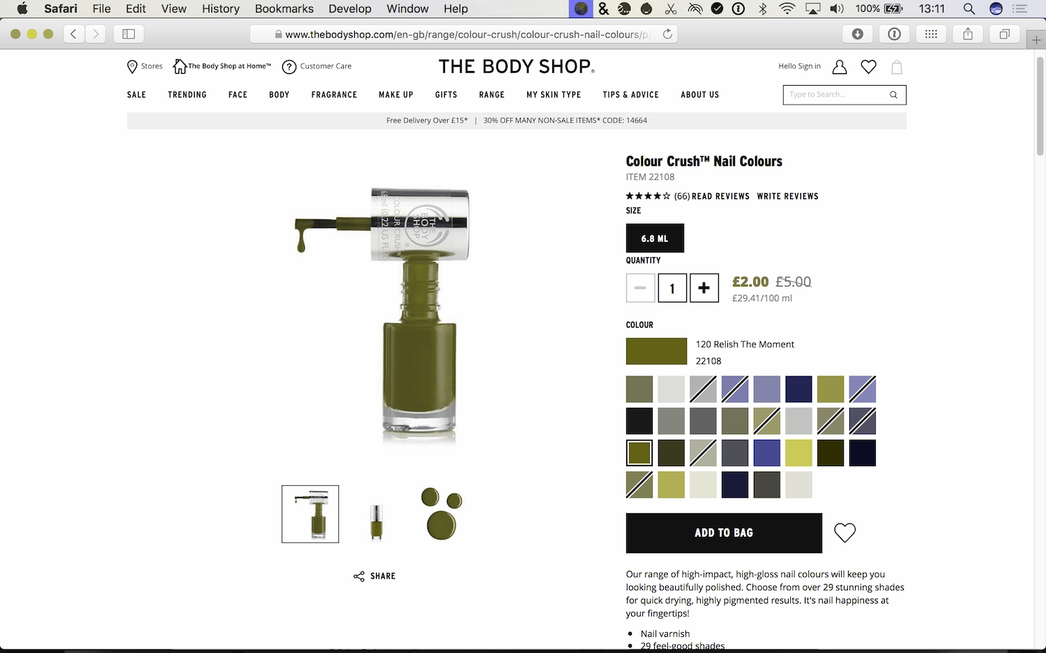
Using both the color swatch and the color name on product pages gives the user a fallback. It also makes the page accessible if the images don’t load.
Red is often used in forms to distinguish required fields or error fields because it’s a bright and eye-catching color. However, to many color-blind and visually impaired users, red is indistinguishable—so a form with errors will look the same as a form without errors. Users with cognitive difficulties or little previous experience on the web may also find it hard to understand (Fig 4.34).
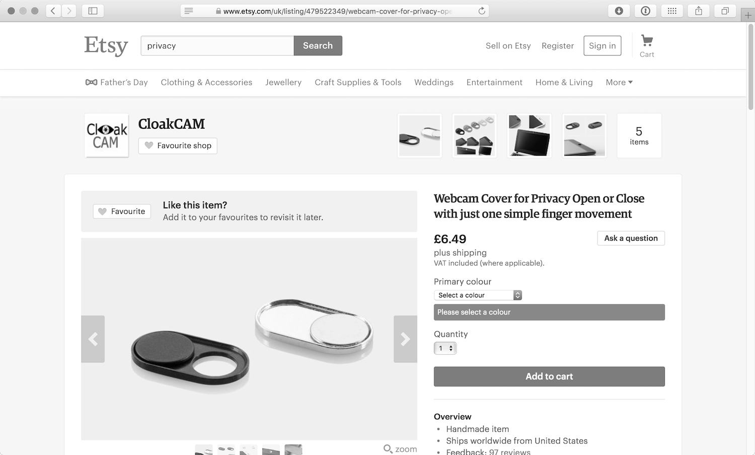
Visual styling is still a valuable tool for getting the visitor’s attention, but using text explanations in addition to red borders will make an error or required field accessible to as many people as possible.
Rich Media
Images are the most popular form of rich media on the web. Many people with learning disabilities or low literacy benefit from content that uses images to support the text. I don’t mean stock photos of people in suits high fiving, I mean photos and illustrations that aid the reader’s understanding. Simple diagrams can also be very useful, as people who struggle to read may find it easier to understand information when it’s presented visually.
Alt text
The img element allows us to embed images in web pages. The alt (short for “alternative”) text attribute provides a text alternative to the image, which is shown to people if the image doesn’t load, or if they’re using a screen reader, which can’t read images.
When we add the alt attribute to HTML, we’re providing visitors with an alternative to content they may not be able to consume. If images haven’t loaded or have been disabled, a sighted user will see the alt text, a screen reader will read the alt text, and a search engine will index the alt text. We can add alt text to our HTML like this:
<img src="DSCF0017.webp" alt="the most adorable husky puppy you ever did see"/>
When a screen reader comes across an image that has no alt attribute, in an attempt to provide some useful information, it will sometimes read the file name instead. Not surprisingly, when images have digital file names like photo.webp or DSCF0017.webp, that’s not very useful at all.
Providing text alternatives for images can help someone understand the context of an image without seeing the image itself. We don’t need to be overly descriptive. Poor alternative text for an image might be something like “a dog in the park.” But describing the image as “My dog Oskar sitting by a hundrastplats sign which means ‘dog park’ in Swedish” gives more context and meaning to the image (Fig 4.35).

Alternative text is not necessary for a decorative image, as decoration is more about providing atmosphere than information. In these cases, we should still use the alternative attribute, but leave the contents of the attribute blank, to tell the browser and screen readers that this image is not important:
<img src="random-stock-photo.webp" alt="">
Simon Cox, senior consultant for global publishing services at HSBC bank, has found accessible alternative text to be a sticking point. Stakeholders sometimes want to use alt text as a space to hide search engine keywords. (Search engines can “see” the alt text just like screen readers can.) However, this provides an awful experience for screen readers. Imagine reading down a page of film posters, and instead of alt text you suddenly hear irrelevant keywords: “husky, malamute, dogs, parks, celebrities, stars, gossip, fashion, photos.” Not cool.
Cox emphasizes that accessibility requirements should always trump search engine optimization: “Normally a good compromise can be found that meets accessibility requirements and will work well for SEO—then everybody is happy.”
Text in images
Using images to present text was very popular before the days of webfonts, and unfortunately still persists occasionally to this day. However, text in.webps, GIFs, and.webps can’t be resized and, if zoomed, becomes pixelated and harder to read. It also can’t be read by screen readers, search engines, or autotranslators, and any revisions to the text become much more labor-intensive. In short, it’s a terrible idea.
It’s only worth putting text in an image if it’s part of a logo. That’s the only realistic use case nowadays. With the wide support of Scalable Vector Graphics (SVG), we can also include scalable and stylable text in SVGs, which is a simple way to make graphics more accessible. See Chris Coyier’s Practical SVG on how best to use SVG text (https://a4e.link/04/07/).
Graphs and infographics
Graphs and infographics are a great way to make information easy to digest; they can tell stories and make connections in an engaging way (Fig 4.36). Providing text alternatives to explain the content is usually the most straightforward method of approaching screen reader accessibility (Fig 4.37).
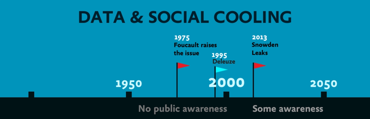
Some ways of going about this are more intelligent than others, though. Simply dumping the words of an infographic into a paragraph won’t be very enlightening for readers, and neither will spitting out all the data from a graph. After all, we use graphs and infographics to make it easier to understand data—presenting that data as a chunk of obscure text defeats the point. It might help to think about how you would explain the contents of the media to someone over the phone, or via email. Ask yourself: what are the highlights and lowlights of the infographic you’re describing? What are its important and notable parts?
A text alternative may also be of use to someone who, because of cognitive or learning challenges, has difficulty understanding data presented in graphs and infographics. Furthermore, a text alternative offers a backup for all users, in case the image hasn’t loaded or the graphing library isn’t supported.
PDFs
When we’re using the web, we expect content to be provided in a format that can be consumed on the web. Sites that offer content in PDFs, however, are dashing all those hopes and expectations.
Links to PDFs have inconsistent behaviors. Some web browsers will display the PDF in the browser window, but many will download the PDF to be opened and read by software on the device’s operating system. The change of context breaks the flow, and makes it much harder for the user to regain their place in the website.
And PDFs themselves aren’t accessible. As they’re a proprietary format created by Adobe, not everyone can open and read PDFs without downloading additional software. They also take a lot more time and effort to make them readable by search engines and screen readers—at least HTML can be read by default.
Instead of using PDFs to provide content, recreate the content using HTML. It will be easier to find, easier to read, and a lot more accessible. If you need your content to be suitable for printing, consider print stylesheets that instruct the browser how best to style each HTML page when printed. Smashing Magazine (https://a4e.link/04/09/) and CSS-Tricks (https://a4e.link/04/10/) both have good articles on creating print stylesheets.
Tools that produce HTML from PDFs are also an option if your organization has loads of PDFs that need to be put online in a more accessible format. A quick web search will reveal plenty of PDF-to-HTML conversion tools. You don’t need a tool that perfectly reproduces the PDF, as long as the conversion outputs usable HTML that can be slotted into your existing page templates.
Transcripts
When it comes to audio and video content, the easiest way to make it available to a wider audience is through transcripts. Transcripts are a text equivalent of speech and are usually less expensive and time-consuming to create than subtitles, closed captions, and sign-language interpretation.
Transcripts are useful to a wide range of people confronting any number of scenarios:
- hearing impairments
- difficulty cognitively processing audio
- non-native familiarity with the audio language
- noisy environments that make listening difficult
- quiet environments that make audio disruptive
- low bandwidth, which can cause make downloading audio and video to be slow and/or expensive
Personally, I prefer transcripts to videos; I find I concentrate better when reading than when listening. Skimming a transcript is much easier than skipping through a video to try to find the information you want.
The least expensive way to produce a transcript is to transcribe the text yourself. This can be a slow and arduous process. When I’ve transcribed short videos, I’ve found that it usually takes four or five times as long as the video itself. Professional transcribers are much quicker and can therefore be very good value for money.
Then there’s speech-to-text software, which can be used to dictate your transcript. However, such software works best in situations with only one speaker, since it usually relies on learning individual speech patterns.
When transcribing audio or video as text, it’s helpful to indicate who is speaking, especially if there are multiple speakers:
Suzy: What do you think of this new lamp I bought?
Aneel: I think I prefer the one we have in the kitchen.
It’s also good practice to include all of the relevant auditory and visual information in brackets to help the reader understand the context of the speech. Think of it like writing a script.
[Suzy is in the hall with Aneel, Emily and Jessica]
Suzy: What do you [Suzy points at Aneel] think of this new lamp I bought?
[Emily nods a sign of approval. Jessica looks at Aneel expectantly]
Aneel: I think I prefer the one we have in the kitchen.
Similarly, you may want to leave out irrelevant auditory and visual information to produce a clean verbatim transcript. “[Jessica coughs]” doesn’t aid the understanding of the text. However, “ums”, “ers” and other stutters and hesitations can offer more context and humanize a transcript. Including these details produces a true verbatim transcript, which is usually costlier than a clean verbatim transcript.
[Annie looks at the food on Sam’s plate]
Annie: That looks… um… tasty.
There aren’t any particular standards for formatting transcripts, and they work best as good old HTML. Rendering your transcript in well-structured HTML makes it easy to read and easy for search engines to find. I prefer to add headings and links to my transcripts as it makes them even easier to navigate and provides additional value over the audio or video.
Subtitles and captions
If you’ve watched a movie in a language that’s foreign to you, you’ve probably seen subtitles. Subtitles are lines of text that are usually transcriptions or translations of what’s being spoken on the screen. They appear at the same time as the spoken word, so you can understand the movie without speaking the same language.
Closed captions, on the other hand, provide the same information present in subtitles, but also include other audio cues, such as “[music]” to describe when music is the only sound, or “[doorbell rings]” when an important sound effect is heard. Only important audio cues that are pertinent to understanding the movie are included in closed captions. Having “[sirens in distant background]” in a scene set in New York wouldn’t provide much meaningful detail when describing a city known for its loud traffic.
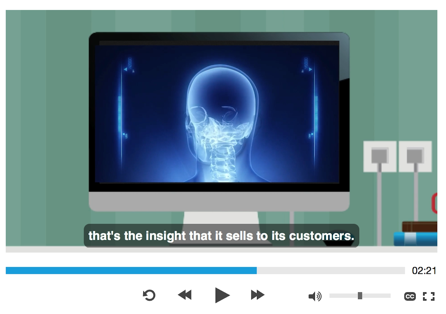
As with transcripts, there are professional services that will create closed captions for you, but as it’s time-consuming work, these services can be expensive. YouTube has an auto-captioning option on videos, but speech-to-text software can be inaccurate if there is background noise, multiple speakers, or an accent unfamiliar to the software (Fig 4.38).
Producing your own closed captions will be the least expensive option and will enable you to write the most accurate text. Writing good closed captions is an art. You don’t want to show too much text on the screen at any one time, as it makes it harder to read alongside the main picture (Fig 4.39).
Closed captions are most comfortably read in short bursts, since they are shown at exactly the same time as the speech and sound on screen. If there are pauses or silence in the speech, the captions can be shown for longer, giving readers more time to absorb the text. Full sentences are far too long, and the text shouldn’t carry over into two lines unless your screen size is very small. If you watch closed captions on TV, or in a movie theater, you’ll get an idea of the right line length and where it’s comfortable to put a break in a phrase.
Both YouTube and Vimeo have functions for uploading your own closed-caption files, and you can create closed captions for YouTube inside their video editor. Whether you’re rolling your own video player using HTML5 or using YouTube or Vimeo, you can use a Web Video Text Track (WebVTT) file (.vtt) for your captions.
A .vtt file is a simple text file that lists all of the text for the captions, with timestamps telling the text when to appear on screen. It can also include meta information such as a chapter list and description of the video, as well as simple styling and structuring markup.
WEBVTT

00:00:00.782 --> 00:00:05.000

Today, on Spyware 2.0: "Privacy"

00:00:05.100 --> 00:00:07.493

When we think of a private conversation,

00:00:07.593 --> 00:00:10.593

we think of it taking place between two people.

00:00:10.896 --> 00:00:12.380

And that's how it should be.

00:00:12.480 --> 00:00:14.547

Just between you and the person you're having

00:00:14.647 --> 00:00:16.715

the private conversation with.
The .vtt markup is simple and very readable, but it takes a lot of time to work out the correct timestamps to mark up each caption. There are a few free apps (see Resources) that help you create captions. These tend to work with an audio or video file, and provide an interface that makes it easy to add and edit captions while hearing or watching the audio or video playing.
A Generous User Experience
Designing user experiences often means making assumptions about users’ preferences. While we should question those assumptions, and use research to better inform ourselves about user preferences, sometimes just providing a different way, an alternative, can make a huge difference. Alternatives allow someone to choose whichever way works best for them.
Even when people have an impairment that could benefit from an assistive technology, we should never assume that they’re using an assistive technology. Maybe their disability isn’t severe enough to benefit from assistive-technology support. Maybe technologies that could help them, such as screen readers and custom input mechanisms, are too expensive. Maybe they aren’t even aware that technologies that could help them access the web exist. Sometimes, too, people have a secondary impairment, and use technology specific to another need.
Some people rely on alternative ways of consuming content, while others simply prefer certain formats. I’m not a fan of watching long videos of conference talks; I’d far rather skim through a transcript with pictures of the slides to find the bits that interest me the most. I’m not suggesting that we should provide several different versions and formats of our sites to please everyone, but providing alternatives for accessibility reasons has the side benefit of working for a much wider audience.
We can make small, thoughtful changes to our websites. We can be generous with our design. We can make great, rather than just adequate, experiences.
Now that we have a good foundation in making usable interfaces, we can look at how to mark up those interfaces, giving them structure and meaning that is accessible in the browser.