Disabilities and Impairments
“Without the internet, I’d be stuck. I can’t use books. I’d be sitting in the corner with a dunce’s hat.”
—Sam
Meet Sam. He’s my brother. In many ways, he’s no different from so many people who happen to build websites: he’s a college graduate in his late twenties; he loves music, sports, reading, video games, and movies; and he spends tons of time online.
But the internet isn’t easy for Sam to use. He has to focus, concentrate, and be determined. Any task he undertakes will probably take two or three times the amount of time it would take me. Using the web isn’t something Sam can do in five minutes with the TV on in the background; it’s an all-or-nothing task. And since there’s a limited amount of time in the day, he has to prioritize what he wants to do in that time. If a website forces him out of his comfort zone, it becomes a chore and won’t be worthwhile.
Sam has cerebral palsy (CP), a neurological condition that mostly impacts muscle control and movement. CP affects 1 in 400 people, and is completely different from one person to another. Some people with CP are Paralympic footballers, while others with CP have very little muscle control and need to use a wheelchair to get around. Sam’s CP is moderate to mild. He can walk unaided, but his balance can make it slow and precarious. His limited fine-motor control makes using mice and keyboards difficult. His body has constant small tremors and spasms, which means that any kind of physical input requires a lot of concentration.
And Sam has other impairments that, while not directly related to cerebral palsy, are common among those with CP. He’s shortsighted, so he needs to wear glasses when he’s reading from a screen. He also has dyslexia, which makes reading exhausting and makes it hard for him to concentrate for long periods at a time. The combined challenges in reading and typing make online communication hard work.
Despite these difficulties, Sam spends nine hours a day on the web. He loves research and fact-checking. The internet allows him to find out information on almost anything in the world. His brilliant memory leads him to combine and contextualize information unlike anyone else I know. In Chapter 1, I cited a common misconception that disabled people don’t use the internet—and yet Sam couldn’t do without it: “I can’t imagine what life was like for disabled people before the internet. It allowed me to function in a mainstream educational environment.”
Defining Disability
An estimated 37,627,800 people in the US—12.1% of the population—have a disability. In the UK, 16% of working-age adults have a disability, amounting to over 11 million people. But what is a disability?
Disabilities is an umbrella term, covering impairments, activity limitations, and participation restrictions. An impairment is a problem in body function or structure; an activity limitation is a difficulty encountered by an individual in executing a task or action; while a participation restriction is a problem experienced by an individual in involvement in life situations.
—World Health Organization
That’s a tricky description, because impairments are multilevel and spread across a spectrum—we are all physically abled in different ways, some more than others. If you wear glasses, you probably don’t consider yourself disabled; but if your eyesight were to deteriorate by a few degrees, you may suddenly find yourself needing further assistance.
Individuals may also have more than one impairment, which alone don’t cause much difficulty, but together can create a more significant disability. For example, age may cause your eyesight to deteriorate, forcing you to enlarge screen text size, while arthritis might leave you with impaired coordination, making a mouse awkward to use, particularly with accuracy and at speed. The combination would have quite an impact on your ability to use the internet.
“Disabled”
There are many nuances in the language around disability. In the US and UK, disability-rights groups tend to refer to a person as being “disabled”: “Sam is disabled.” However, many people have started using “has a disability” instead: “Sam has a disability.” Using “disability” as a noun changes the focus: Sam has a disability, but he is not defined by that disability. Others with disabilities prefer the adjective “disabled” for the opposite reason: the world disables them when it forces them to interact in environments that aren’t designed to consider their needs.
In this book, I talk about people who have disabilities, rather than people who are disabled. When we’re designing for the web, thinking of the person before the disability helps us focus on universal design: we consider the needs of our diverse audience rather than create a false separation between “people without disabilities” and “people with disabilities.”
Types of Disability
Five main areas of disability affect our use of the web: visual impairments, auditory impairments, motor impairments, cognitive impairments, and vestibular disorders and seizures.
Visual impairments
A huge spectrum of disabilities involves eyesight, and gives rise to a wide range of needs. Problems with eyesight aren’t just focused on the function of our eyes, but also on how our brains perceive what our eyes see. Conditions such as nearsightedness, farsightedness, and astigmatism are very common in people of all ages and tend to worsen with age. Conditions can also vary from day to day, and throughout the day. Visual impairments affect everything we see on the web, and can benefit from considerate text sizes, typography, and layouts.
Color blindness
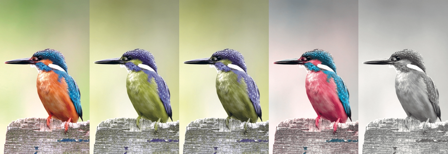
Color blindness is a common visual impairment that affects up to 8% of men and 0.5% of women. Color blindness doesn’t mean that a person can’t see any colors, or that they only see in grayscale, but that they cannot see a particular color or distinguish certain colors from one another.
Normal color vision uses all three light cones in our eyes, and is known as trichromacy. Each cone has a different sensitivity to light wavelengths—red, green, and blue. Deficiencies in different cones create different types of color blindness (Fig 2.1):
- Deuteranopia causes reds to look lighter, and makes them easily confused with greens.
- Protanopia is a rare red-cone deficiency that makes pinks appear blue, and makes dark reds and blacks easy to confuse.
- People with both deuteranopia and protanopia are known as red-green color blind. They have difficulty distinguishing between reds, greens, browns, and oranges, and may confuse blue and purple hues.
- Tritanopia is an extremely rare blue-cone deficiency that causes people to confuse blue with green and yellow with violet.
- Monochromacy is the rarest type of color blindness, affecting just one person in 33,000. It’s similar to seeing in grayscale. Affected people often wear dark glasses in normal light due to increased light sensitivity.
Color blindness has a significant impact on the readability and comprehension of a page. Text colors need to be readable against background colors, and because different people perceive color differently, it’s unreliable to use color to signify meaning.
Eyesight loss
People with partial eyesight loss need clear labels, readable text sizes, and a high contrast between text and background colors. They may want to invert screen colors or hide background images to make a page easier to read. They may also use a screen reader or braille display, and will benefit from well-written HTML and a text alternative for images and video.
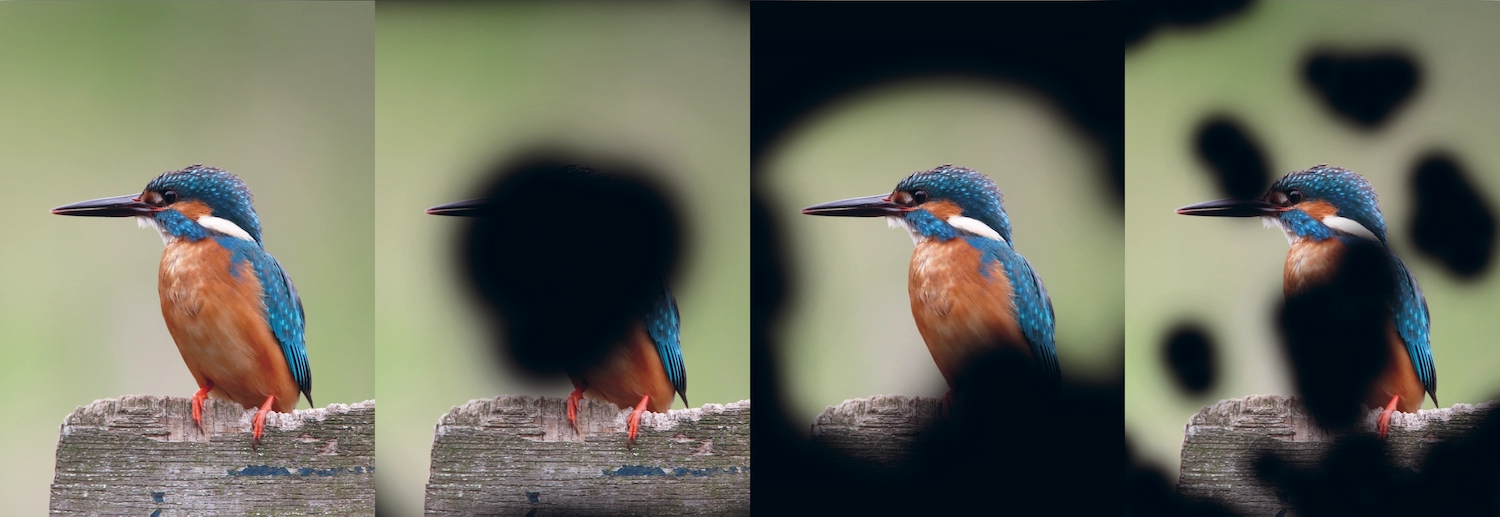
- Age-related macular degeneration is the leading cause of blindness in adults. It causes the center of your field of vision—what you’re looking at directly—to be blurry or obscured, making it hard to watch TV, look at photos, and read (Fig 2.2).
- Glaucoma is the result of damage to the optic nerve, and has the opposite effect of macular degeneration: the edges of your field of vision are obscured ([Fig 2.2).
- Diabetic retinopathy occurs when diabetes damages the blood vessels in light-sensitive eye tissue. It causes dark spots in your field of vision, obscuring or distorting what you see (Fig 2.2).
Auditory impairments
Some people with auditory impairments are born with hearing loss, while others lose their hearing through age, illness, or accident.
- Conductive hearing loss occurs when sound can’t get to the inner ear. It’s usually caused by a blockage or abnormality in the ear. This type of hearing loss makes sounds quieter, but not usually distorted.
- Sensorineural hearing loss (sometimes referred to as sensory, cochlear, neural, or inner-ear hearing loss) is caused by damage to the nerves in the ear, distorting sound and making speech harder to understand.
Many people with hearing loss use written and spoken language to read and communicate, making the web a very valuable tool. Technologies such as email and instant messaging can be useful for communicating where face-to-face or telephone conversations are difficult. However, audio and video content can be inaccessible when alternative ways to view the content aren’t provided.
People who are deaf sometimes use sign language, particularly if they’ve been profoundly deaf since birth. There’s a common misperception that sign language is universal and that it neatly corresponds to spoken language. That’s not the case. For example, American Sign Language (ASL) and British Sign Language (BSL) differ from each other much more than spoken US English and British English do.
Some people with hearing loss can lip-read, but this depends on the person they’re watching. If someone has a different accent and therefore forms different lip shapes from those the lip-reader is used to, they can be harder to understand. Large mustaches and beards are also problematic. (That’s a good reason to keep your fashionable facial hair trimmed!)
Motor impairments
An enormous range of conditions can cause motor impairments: cerebral palsy (as explained earlier in the chapter) affects muscle control and movement; neural-tube defects cause weakness, paralysis, and abnormal eye movement; muscle and joint conditions like muscular dystrophy, arthritis, and Ehlers-Danlos syndrome cause pain and difficulty moving. Traumatic injuries to the brain or spine can also cause a debilitating array of neurological, motor, sensory, and cognitive problems. And physical labor or repetitive movements (as you might find in computer-based jobs) can lead to repetitive strain injury, carpal tunnel syndrome, and other musculoskeletal disorders.
Motor impairments can make the use of standard inputs and outputs difficult. People may struggle to use a mouse, keyboard, or touchpad depending on their physical condition and motor control in their arms, hands, and fingers. Such challenges can also make handheld devices, like mobile phones, completely inoperable.
Interactions that require moving a mouse over a small area, selecting text, and right-clicking—such as filling out forms or using dropdown menus, navigation, and multimedia—can be difficult and time-consuming when small, controlled movements are hard to make. Motor impairments can also mean that user response time is slow: interfaces requiring interaction at a particular time, especially in games and animations, may result in missed cues.
As mentioned earlier, my brother Sam has limited fine-motor control in his hands. To limit typing, he uses speech-recognition software for writing emails and tweets. Sam often finds himself saying the same word over and over again, hoping that the software will pick up on what he’s saying. The software often makes mistakes, which means he needs to say “scratch that” aloud to undo the last typed phrase. He’s constantly frustrated that the software fails to recognize what he’s saying. Speech-recognition software still has a long way to go before it can provide a flawless experience.
Cognitive impairments
Cognitive difficulties are incredibly diverse, and the way people interact with web content will vary depending on their condition. Cognitive issues that are particularly relevant to the web include:
- Memory: difficulties remembering the task one is trying to accomplish, or where one is within a site.
- Attention: difficulty focusing on large amounts of information, or any information for prolonged periods.
- Problem-solving: difficulty processing information, particularly if the content on the page is not what’s expected.
- Text processing: difficulty understanding text, and difficulty expressing understanding through speech and language.
- Math processing: difficulty understanding mathematical concepts and symbols, such as telling the time or distinguishing quantities, money, and pricing.
- Visual processing: difficulty interpreting visual information, or understanding visual representations of real-world objects (such as icons).
Learning disabilities
Learning disabilities are common in people of all ages. People with learning disabilities can be sensitive to visual clutter or too many options. They often benefit from supplemental content to aid understanding, such as video and audio to clarify text; or symbols, captions, and transcriptions to make video and audio easier to understand.
Dyslexia is a general term for disorders that result in difficulty in learning to read or interpret words, letters, and other symbols. Dyslexic readers sometimes find it easier to read using specific text and background color combinations. Including a dyslexia-friendly option in your site’s preferences will allow people with dyslexia to have a better experience each time they visit your site.
The British Dyslexia Association allows visitors to choose their preferred color palette from a menu at the top of the screen. The menu also relies on symbols over text, making the site easier for people with dyslexia to use. I found the site somewhat hard to use, as I’m not dyslexic and I’m more accustomed to text-based menus. This is a great example of an organization prioritizing the needs of its target audience over other audiences (Fig 2.3).
Even though he isn’t blind, Sam—like many others with dyslexia—relies on screen readers when using a computer. He finds JAWS’s voices too robotic, and prefers NaturalReader by NaturalSoft Ltd. (https://a4e.link/02/03/) to hear the text in natural speech form. Sam usually chooses to copy and paste the text he wants read aloud into the software, rather than it reading whole pages. He doesn’t want the screen reader to read him the meta information (such as headings and alternative text for images), which distracts him from the primary text.
Literacy
The global adult literacy rate was 85% in 2015, with 757 million illiterate adults—often the result of limited education or learning difficulties. We can also consider that low literacy arises contextually for individuals whose first language is different from the native language of their surroundings.
We can make sites more accessible to people who struggle with literacy by making copy as simple as possible, and including paragraph headings to help people keep their place in the text. When creating forms, offering multiple-choice responses rather than free-form text fields benefits people who have difficulty with writing.
Vestibular disorders and seizures
Vestibular disorders are common, affecting as many as 35% of adults aged forty years or older in the United States. Vestibular disorders are caused by damage to the vestibular system—the parts of the inner ear and brain that control balance and spatial orientation—causing dizziness, vertigo, cognitive confusion, and hearing and visual disturbances.
This often manifests as motion sensitivity on the web. Animations, unconventional scrolling, and parallax backgrounds can cause headaches, dizziness, and nausea, sometimes lasting long after the animation is over.
We can help people with vestibular disorders by giving them control over the animation and motion experiences on our websites. As Val Head wrote in “Designing Safer Web Animation For Motion Sensitivity”: “Consider offering an option to turn off, or reduce, motion… Providing what essentially boils down to an alternative way to view that content, or a little extra control, can be a big help for anyone sensitive to motion.” (https://a4e.link/02/04/). In order to be effective, the option to reduce motion should be presented to users before any animation happens.
Similar considerations can also help prevent seizures. Between 5–10% of people in the developed world will have at least one seizure in their life. About three in 100 people with epilepsy have photosensitive epilepsy, where seizures are triggered by flashing or flickering lights, as well as by high-contrast, striped, or checked patterns.
Obviously, we don’t want to trigger seizures in people, and very specific guidelines (https://a4e.link/02/05/) exist to help us avoid accidental triggers. Web pages shouldn’t contain anything that flashes more than three times in one second. Unless you’re creating the world’s most annoying banner ad, this is unlikely to be the purposeful result of a design. But animations and hover effects should be checked to ensure that flashing isn’t a byproduct when an effect doesn’t render as intended.
Environmental Factors
Context has a huge effect on how we use the web, sometimes creating temporary impairments and other obstacles. These include:
- browsing with legacy browsers or operating systems;
- browsing with mobile devices, game consoles, and other non-desktop devices;
- low bandwidth or an intermittent internet connection;
- browsing sites that aren’t in our native language, or a familiar culture;
- bright light, rain, or other weather-based conditions;
- noisy or highly distracting environments; and
- ultra-quiet environments (like shared office space, libraries, or a home with sleeping babies).
Such environmental factors suggest that it’s not just those with physical impairments who benefit from more accessible websites. The web industry started designing responsive websites so we could be more future-friendly, and if we want to continue to improve people’s experiences on the web, accessibility should be at the core of responsive web design.
Browsers
When I started out doing web development, websites could look very different from browser to browser. Development was fraught with hacks to make sites perform similarly across browsers, and we all owed a huge debt to the smart developers who came up with clever ways around bugs. Luckily, with more browsers sharing rendering engines, and better web standards support, websites now render much more consistently across browsers.
Still, many organizations—particularly non-profits and others dependent on public funds—are stuck using old versions of operating systems and browsers because of the software and intranets they need to do their jobs. Proprietary and specialist software can be expensive and time-consuming to upgrade and replace, making it insecure, unstable, and unreliable when used with any future browser releases.
Most modern web developers test their sites in more than one web browser, making cross-browser testing one of the most common forms of accessibility testing: the very act of checking that a site performs well in more than one browser is a way of considering a wider audience.
But a decade ago, smartphones made web browsers on mobile phones usable and useful to a mainstream audience. We quickly optimized our sites for small touch screens. Then many additional devices emerged on the scene.
Devices
Screen size, screen resolution, and screen orientation vary widely from device to device. Input mechanisms may include keyboards, mice, touchscreens, multi-directional pads, motion sensors, or voice control. Some devices have a choice of web browsers, some only have one browser, and often the web is just a “dumb pipe” simply feeding content to the device’s own interface. Mobile devices and smartwatches are usually designed to be owned and used by one individual, but game consoles and TVs are often interacted with by multiple people at once. Designing for the web across all these devices is enough to make your head spin.
New sizes and shapes mean we need to design for even more viewport sizes and viewing distances. In other words, we need to continue to design responsively: responsive websites are, by design, accessible to wider audiences.
Context and control
At least 87% of the devices able to access the web are “mobile” now (https://a4e.link/02/06/), and that’s not including game console browsers (increasingly popular with younger audiences), web-enabled TVs, smartwatches, or virtual reality headsets.
And mobile doesn’t mean “on the go,” as many of us imagined when mobile devices started becoming popular. Studies have shown that we shouldn’t jump to conclusions about user situations based on their devices. A US-based study from AOL and advertising agency BBDO found that 64% of users browse the web on their mobile devices while at home, sitting on their sofas, using their Wi-Fi and broadband (https://a4e.link/02/07/). And research from the Interactive Advertising Bureau (IAB) and its Mobile Marketing Center of Excellence (https://a4e.link/02/08/) showed that 63% of videos watched on mobile phones were at home and not, in fact, “on the go.”
The only reliable statistic we can get back from a person’s browser is the width of the viewport. We can’t even trust the user agent (the browser telling us its name), as some browsers pretend to be others to get better support from browser-specific styles.
The same is true for assistive technologies, such as screen readers and screen magnifiers. There are no user agent strings for these assistive technologies, leaving us with no idea of how many people are accessing the web with assistive hardware or software. We’re left with little choice but to treat these technologies the same way we treat other devices—build for the unknown and test on as many as possible.
The lack of control that we have over devices may seem like a nightmare when creating websites, but it can also be an asset. It encourages us to build more flexible, future-friendly sites that will work on as many devices as possible, making them more likely to support devices with new capabilities. With this wider range of support, our sites are likely to have a much longer lifespan.
Connectivity
The speed of our internet connections has always been a barrier to accessing the web. Prior to the year 2000, in the days of dial-up, the UK had a 56 kb/second speed connection—it would often take sixty seconds to load a web page. In this context, speedy website performance was very important for making a site available at all.
Starting in 2002, broadband connections became more widely available in both the US and UK. Broadband is certainly faster, but not perfect. Connections can be slow due to the distance from the exchange or a poor setup. Have you ever been on the free Wi-Fi at a conference or at an airport? Nothing is guaranteed to slow or crash a Wi-Fi network like a huge number of people trying to connect at the same time.
Similarly, imagine someone working at a coffee shop, using a laptop on a 3G network. When our analytics tell us that the visitor is accessing our site via a desktop browser, we might assume they’re on a speedy broadband connection—even though they may be struggling to connect via 3G in an overcrowded city with poor network infrastructure.
And not everybody across the world has access to broadband. Even in the US and UK, high-speed connections are still not widely available in rural and remote areas.
Reliable broadband is common in the tech industry and it’s made it easy for us to forget that many of our users may have a slower connection. In striving for better performance, we’ve become desperate to know the speed of our visitors’ connections. To make up for our lack of knowledge, we make assumptions—daft ideas like, “I’ll only show the store locations on mobile devices because people who are using mobile phones are on the go.” But, as we’ve just seen, this is hardly based in fact. We must give up thinking that we can know people’s connective contexts, and enable a web that’s accessible regardless of connection speed.
Languages
Like many Brits, I’m terrible at speaking other languages. We privileged native English speakers like to think of English as the lingua franca when we visit other countries, and we tend to act that way on the web as well.
However, the web is worldwide (the clue is in the www!). Not everyone on the web can read and understand English as well as native speakers. We can make our websites much easier to use by making them friendly to other languages.
Localization through translation is the most obvious solution, but it’s a tricky business. Professional translation may convey your message to more of your visitors, but it costs a lot of money. A cheaper option is to rely on browser-based autotranslation, such as Google Translate, and website plugins. These can make your website easier to understand, but such translations are imperfect. When Kentucky Fried Chicken (KFC) took their brand to China, they didn’t use a native translator, and their famous tagline “Finger lickin’ good” became the less appealing “We’ll bite your fingers off.”
A cost-effective starting point is to simplify your language. Plain language is good usability, making content easier for non-native speakers to understand.
Of course, different audiences dictate different levels of technicality in language. A site aimed at specialist plumbers who know the difference between a stack vent and a wet vent can expect this kind of terminology to be understood. But even technical sites can benefit from the principles of plain language. Writing simply will broaden your audience—and chances are, it’ll make automatic translations better, too!
Alphabets and characters
In English, we have an alphabet made up of twenty-six letters, and only use marked letters when borrowing words from other languages, as we do with naïveté or Beyoncé. Other languages may use accented letters, additional or fewer letters, entirely different alphabets, or even different punctuation marks.
For example, quotation marks vary wildly across Western languages. In English, we primarily use “…” to distinguish a quote, but in many Eastern European languages, the first mark sits on the baseline of the text: „…”. In French or Italian, «…» is preferred, but it’s »…« in Danish.
A character set (more technically known as character encoding) is a defined list of characters that is recognized by software and hardware. For example, the American Standard Code for Information Interchange (ASCII) is a character-encoding standard that maps English letters to numbers that computers understand. For instance, a lowercase w is 119 in ASCII. Europe’s International Organization for Standardization (ISO) character sets are similar to ASCII, but include additional characters (like à, ö, or æ) needed for European languages.
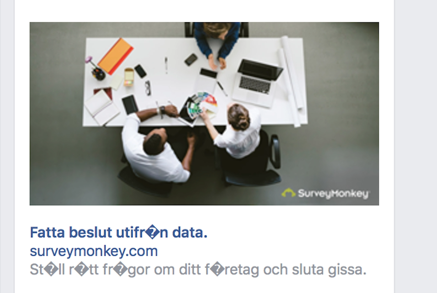
If the character sets that make up our alphabets don’t contain all the necessary characters for a given language, we can end up with ugly errors in our text. These don’t just look bad; they make the words unreadable (Fig 2.4).
When selecting a character set for your website, it’s always worth double-checking the character sets for foreign-language characters in case the text is translated. (Remember, if a reader is using a translation browser plugin, text can be translated without your input or knowledge.)
When choosing webfonts, you also need to make sure that your fonts contain all the characters required to set the text without errors, regardless of language or alphabet. Most webfont services will allow you to choose the subset of characters embedded in the font. These additional characters can make your fonts larger and slower to load, but have the advantage of making your text much more accessible.
Reading direction
Text in Western languages is read horizontally from left to right. But text in languages such as Arabic, Hebrew, Persian, and Urdu is read horizontally from right to left (Fig 2.5). Reading from right to left usually leads to right-aligned text, and a mirror-imaging of the left-to-right page layout.
If you want your site to have international appeal, making it work in different alphabets and for right-to-left readers will go a long way toward improving the usability of your site. You can set the direction of the text using the dir attribute in HTML:
<body dir="rtl">
You can also set the direction of the text using the “direction” property in CSS:
body {
    direction: rtl;
}
However, it’s best to add it to the HTML, as it will still display the text accessible to right-to-left readers if the CSS doesn’t load.
Chinese, Japanese, Korean and Mongolian text is mostly read horizontally from left to right on the web, but more traditional or expressive text is often set vertically to be read from top to bottom and right to left. To set the vertical text direction we can use writing-mode: vertical-rl; in our CSS.
Reading a page in an unfamiliar layout can be very slow and challenging, but we can change the text direction depending upon the language displayed. See Chapter 5 for HTML and CSS examples.
Space and context
As designers and developers, it can be easy to get caught up in the interaction inside screens and forget how much the environment outside of screens and devices affects the experience. With access to the internet becoming increasingly mobile, somebody could be trying to use your site up the side of a mountain in the driving snow, or on a desert trail in the burning hot sun. High contrasts between text and background colors will make a great difference to text readability in severe weather conditions!
But environments aren’t just about the weather and light, they can also be about who’s in the room with you. If you’re working in a public space and don’t have headphones, you may not want to play audio content or videos with sound. If you’re trying to get work done in a noisy or disruptive space, you may not be able to hear audio or video, even with headphones. The considerations for these contexts are similar to those for hearing loss—you’d probably prefer subtitles, captions, or another text alternative for the content.
Using the web can also be a personal experience requiring privacy. Sites can be made more usable in these situations (and benefit everybody) by making their information clear and easy to locate, and even tailoring the experience to specific stress cases (Fig 2.6). Sara Wachter-Boettcher and Eric Meyer explain how to identify these stress cases and incorporate compassion into your design process in their book, Design for Real Life (https://a4e.link/02/09/).
Sharing devices can also reveal potential problems. Someone who’s been looking for information on a medical condition doesn’t want personalized ads for therapies and medications following their partner or family member around the web. Respect the privacy of your visitors by default, and ensure you aren’t leaking their information to third parties who may not be so respectful.
Meeting Needs
Statistics are handy when you’re trying to show your boss how many people can’t access your site if you don’t make it accessible. But statistics can’t tell the whole story, or show the extent of the value that accessibility can offer.
Statistics often only apply to people who are registered with long-term or permanent disabilities, as the data is largely gathered for insurance or welfare systems. More detailed data is hard to gather because impairments are unpredictable, and often impermanent. We might have an accident or illness that affects us temporarily. We might struggle earlier or later in the day. And as we age, we’re more likely to experience different levels of visual, auditory, motor, and cognitive impairments (and the aging population is increasing).
There are so many little physiological factors that affect the way people interact with the web that we can’t afford to make any assumptions based on our own limited experiences. In the next chapter, we’ll look at how setting goals for your product’s accessibility can help you avoid assumptions and start meeting real needs.